
Step 1
Paste label-and-value rows
Enter one Label, value pair per line. Raw values can be any positive numbers.
Pie Chart Maker converts a few label-and-value rows into an accurate Pie or Donut chart. Percentages are calculated in your browser, and the result downloads as an editable SVG without sign-up.
Start with a practical share breakdown, then paste your own rows into the maker.
Use a Pie or Donut chart when a small number of categories make up one clear total.
Turn competitor values into a market-share Pie chart that decision-makers can scan in seconds.
Show how a project or department budget is allocated before a planning meeting.
Convert a short list of response counts into percentages for reports and presentations.
Present sample composition or method distribution clearly in papers, posters, and slides.
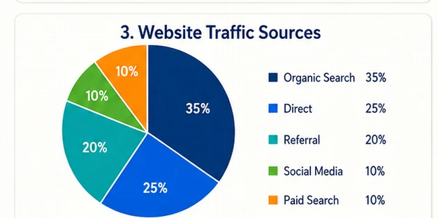
Compare Organic, Direct, Social, Referral, and Email traffic in one labeled chart.
Explain product, service, or regional revenue contribution without rebuilding a spreadsheet chart.
Keep the source rows, percentage calculation, live preview, and vector export in one workspace.
Paste counts, revenue, visits, or survey totals. The values do not need to add up to 100.
Switch the same dataset between solid Pie and open-center Donut without rebuilding anything.
Every label, slice, percentage, and legend item updates while you edit the source rows.
The Pie Chart Maker calculates and renders chart data locally instead of sending rows to an image model.
Copy two columns from Excel, CSV, or a spreadsheet and enter one Label, value pair per line.
Distinct colors, direct percentage labels, and a separate legend keep small share breakdowns clear.
Create a polished part-to-whole chart without a design queue or spreadsheet-formatting detour.
Create and download a Pie or Donut chart without creating an account.
Each slice is calculated from the visible values you provide.
See percentages immediately as you type or paste.
Download vector artwork for further refinement in supported design tools.
Use clean percentage labels in slides, reports, and worksheets.
Copy the rows again whenever you need to update the same chart.
Paste a small set of values, choose the shape, and export the chart you reviewed.
Step 1
Enter one Label, value pair per line. Raw values can be any positive numbers.
Step 2
The tool normalizes the total automatically and updates the SVG as you edit.
Step 3
Check every label and percentage, then save the vector chart for reuse.
Choose the right chart
Use the chart that makes comparison simplest for your audience.
A Pie chart divides one total into labeled slices, so it is best for a few meaningful shares.
Explore Pie chartsBoth show shares. A Donut leaves a center space that can make surrounding labels feel lighter.
Explore Donut chartsUse a bar chart when you have many categories or readers need to compare close values precisely.
Open Bar Chart MakerStart with free credits, subscribe for regular figure creation, or purchase a credit pack for your next paper or presentation.
Continue with a related workflow
Choose a closely related FigEditor tool based on the source material, visual structure, or output you need next.
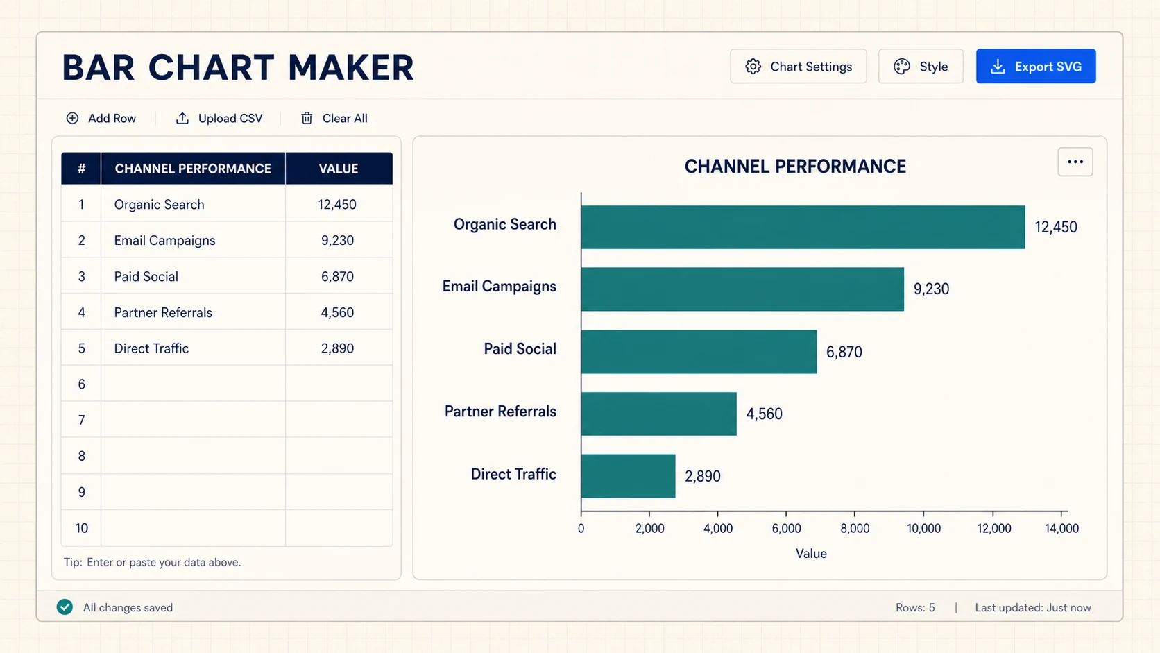
Turn CSV or spreadsheet rows into precise horizontal, grouped, or stacked bar charts, then export SVG or PNG for free.
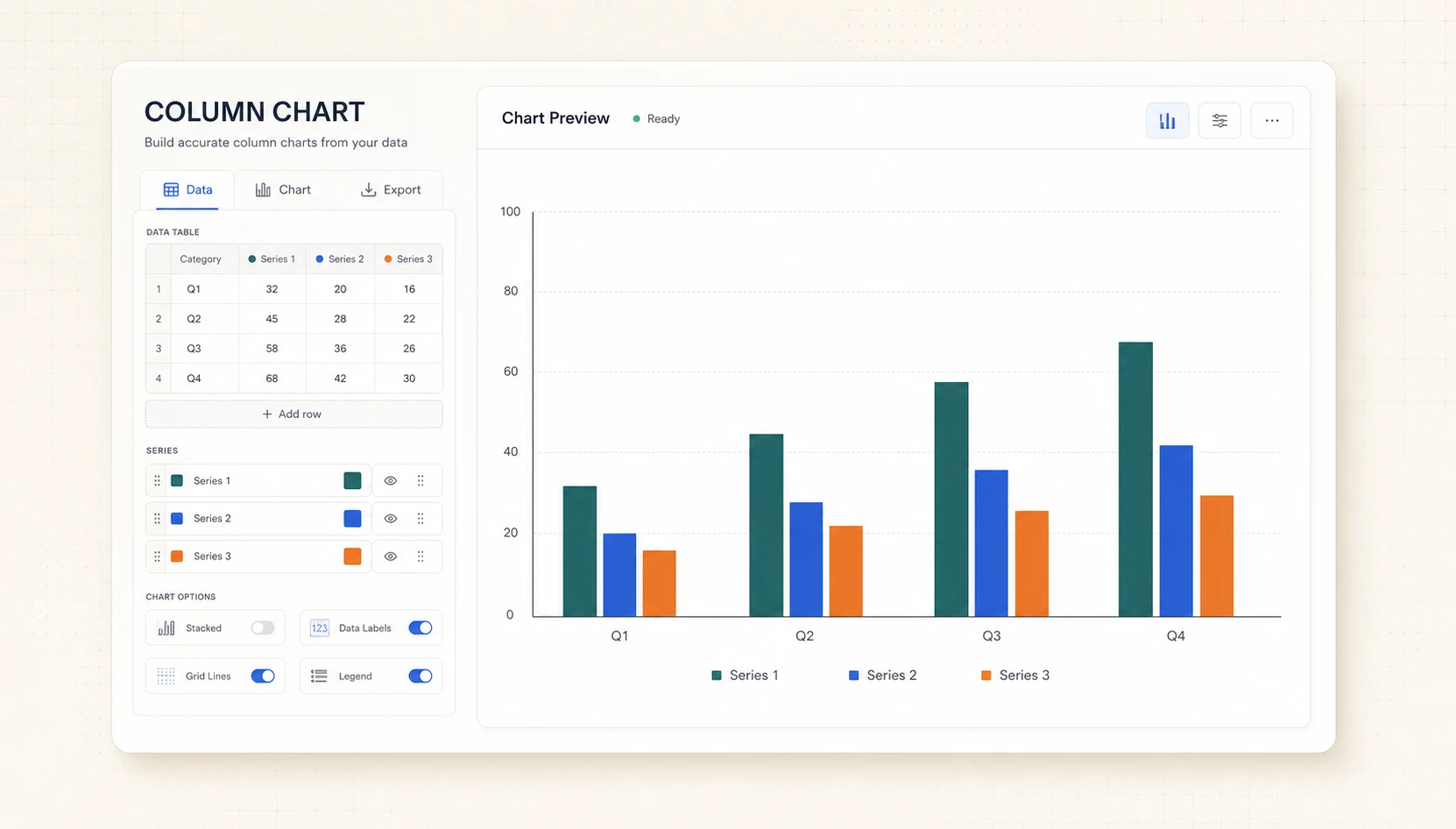
Turn CSV or spreadsheet rows into precise grouped or stacked column charts, then export SVG or PNG for free.
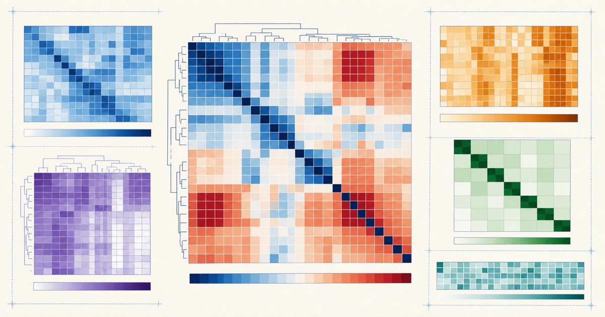
Turn a labeled matrix into an exact color heatmap with values and a shared legend, then export editable SVG or PNG.
Turn pasted values or a chart brief into an editable visual draft, then review every label, scale, and annotation.
Paste a few rows, review the percentages, and download an editable SVG without signing up.
Use 2–6 slices for a chart readers can scan quickly.
Each slice is sized by its share of the total and labeled with a percentage. Download an editable SVG for slides, reports, and worksheets.
Cancel anytime · Subscription credits are valid for 30 days
For individual researchers creating and refining publication-ready visuals
Included tools & models
Creation tools
 Paper Banana
 AI Scientific Illustration
 Scientific Poster Maker
Image models
 Nano Banana
 Nano Banana 2
 Nano Banana Pro
 GPT Image 2
For frequent research, publishing, and client work with commercial use
Included tools & models
Creation tools
Paper BananaAI Scientific IllustrationScientific Poster MakerImage models
Nano BananaNano Banana 2Nano Banana ProGPT Image 2For labs, teams, and agencies producing scientific visuals at high volume
Included tools & models
Creation tools
Paper BananaAI Scientific IllustrationScientific Poster MakerImage models
Nano BananaNano Banana 2Nano Banana ProGPT Image 2