





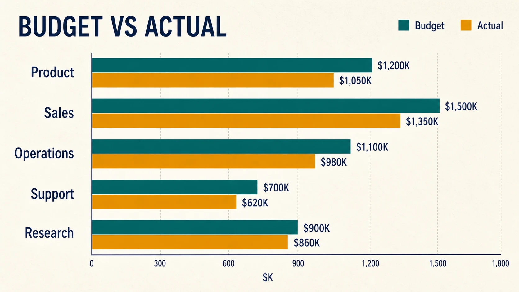
Rank Business and Marketing Categories
Sort products, channels, regions, departments, or KPIs from highest to lowest and preserve each full category label.
Paste spreadsheet data or upload CSV to create accurate horizontal, grouped, stacked, and 100% stacked bar charts. Every bar is rendered from your exact values in the browser. No sign-up, no waiting, and no AI credits.
Direct answer
A bar chart maker turns category labels and numeric values into rectangular bars whose lengths show the differences. Horizontal bars work best for long labels and rankings. Grouped, stacked, and 100% stacked layouts compare multiple series, totals, or proportions.
Start with a practical horizontal chart, grouped comparison, 100% stacked survey, or positive-and-negative dataset, then replace every value with your own.
Use bar length to communicate rankings and category differences while keeping long labels easy to scan.
Sort products, channels, regions, departments, or KPIs from highest to lowest and preserve each full category label.
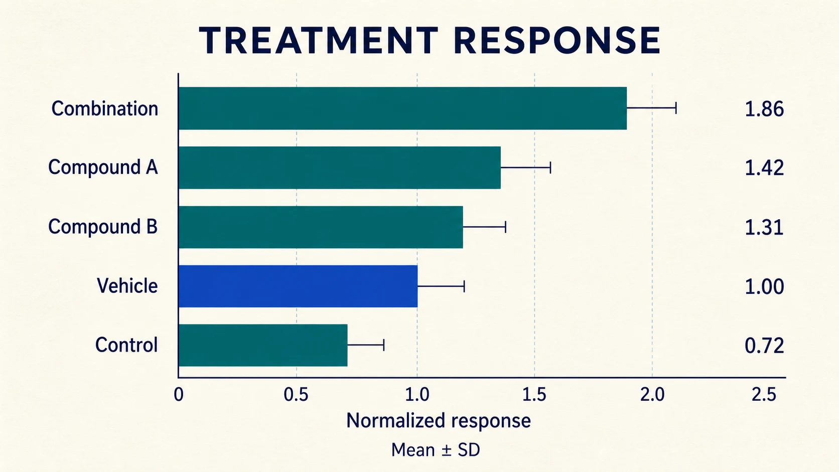
Turn visible source values into an accurate zero-baseline chart for treatment groups, outcomes, frequencies, or coded themes.
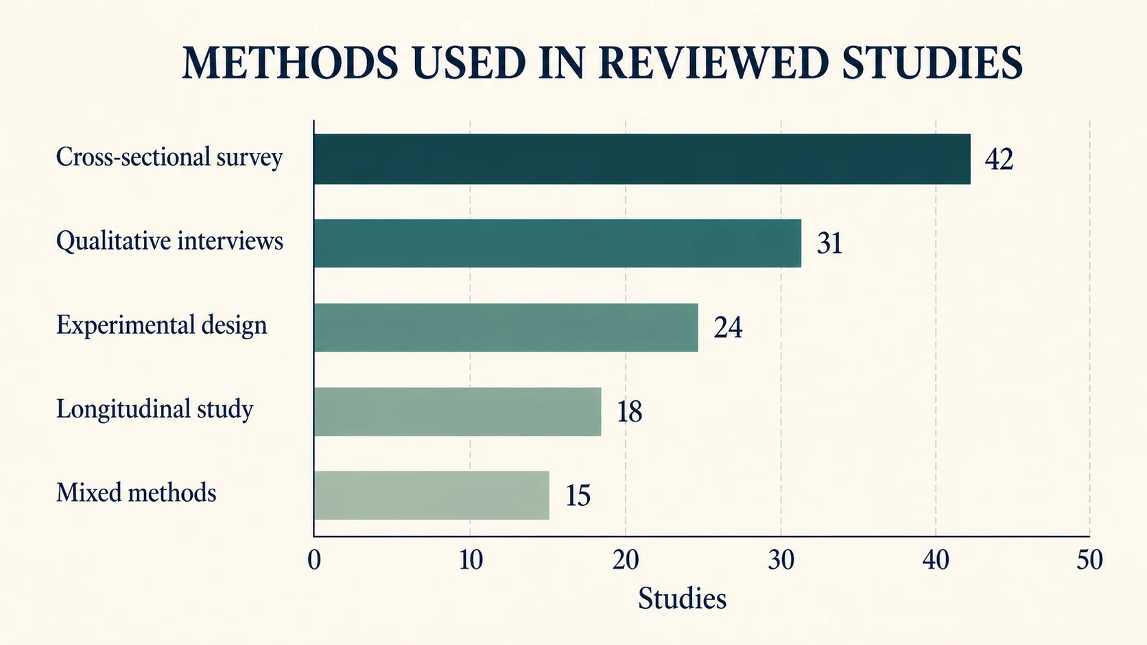
Use grouped or 100% stacked horizontal bars to compare ratings, priorities, response shares, or study counts.
02Bar Chart Capabilities
The focused workspace keeps data entry, orientation, layout, sorting, styling, and export in one place.
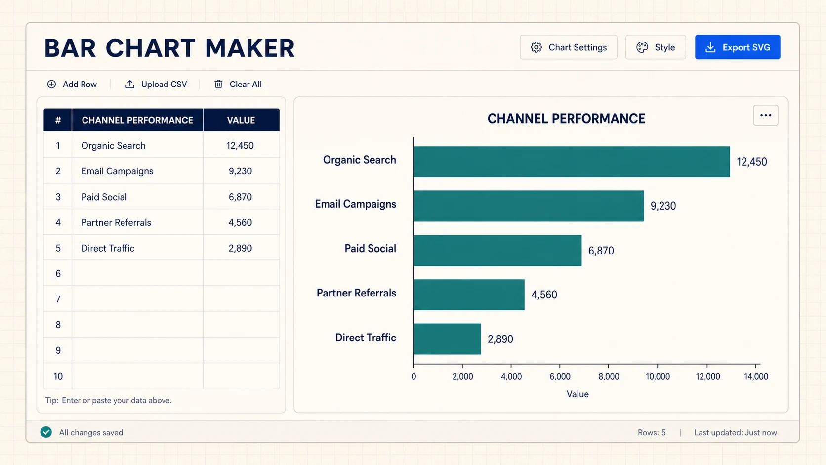
Horizontal bars keep survey questions, product names, research methods, and ranked categories readable without diagonal or truncated axis text.
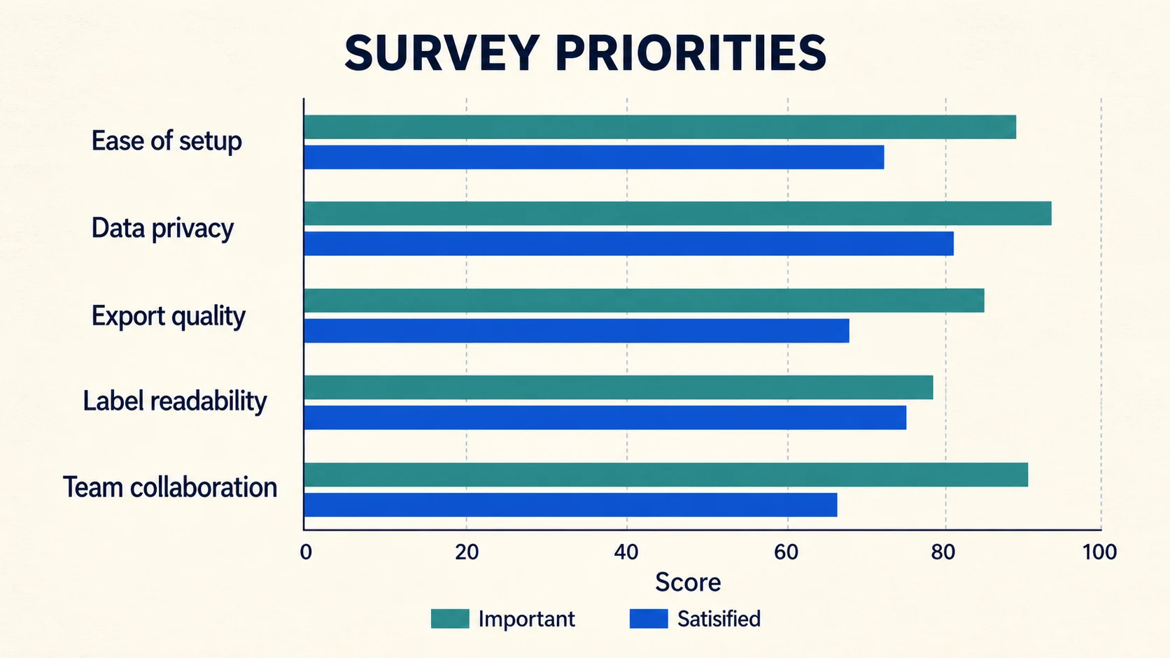
Use grouped bars for direct value comparison, stacked bars for totals and composition, or 100% stacked bars for proportions.
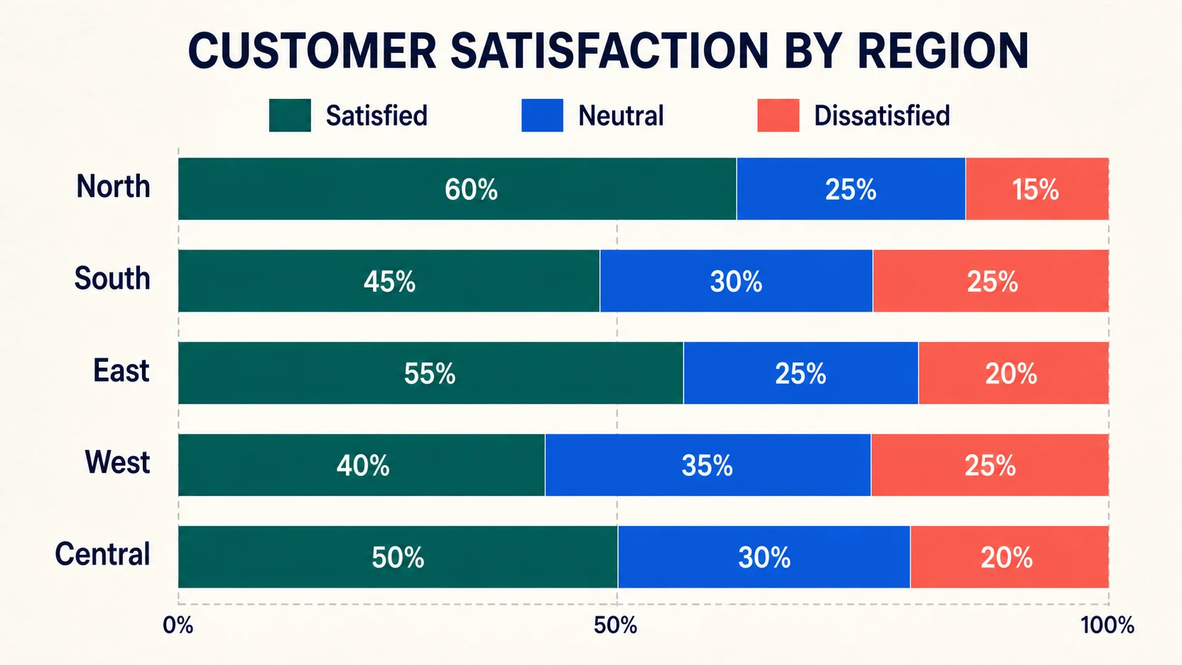
Download a sharp vector chart for editing, a PNG for quick use, or the CSV data that produced the visual.
Choose the right structure
Match the layout to the comparison you need instead of forcing every dataset into the same chart.
| Bar chart type | Best for | What it shows |
|---|---|---|
| Horizontal bar chart | Rankings, long labels, and many categories. | One value or series for each category, read from top to bottom. |
| Grouped bar chart | Side-by-side comparison of two or more series. | Direct differences between series within every category. |
| Stacked bar chart | Totals and the parts that make up each total. | Combined magnitude plus the contribution of each series. |
| 100% stacked bar chart | Survey shares, proportions, and composition. | The percentage mix within categories normalized to the same length. |
| Diverging bar chart | Positive and negative values around zero. | Direction and magnitude on opposite sides of an honest baseline. |
Accurate by construction
FigEditor calculates bar geometry directly from the visible table in your browser, so the result stays repeatable, inspectable, and honest.
Every grouped bar and stacked segment is calculated from the numeric cells instead of being painted by an image model.
Horizontal space protects long labels, while the value axis begins at zero and shows a clear center line for negative values.
CSV parsing, sorting, chart calculation, and SVG rendering happen locally; the generator does not upload your table.
Finish a common comparison task quickly without losing accuracy, privacy, or control over the exported chart.
Edit a label or value and the SVG preview updates immediately, without a generation queue.
Real-Time Preview
Paste rows from Excel or Google Sheets instead of learning a chart specification or full design application.
Spreadsheet-Friendly
Precise browser rendering is free and does not consume image-generation credits.
Free Core Tool
SVG output preserves axes, labels, legends, and bar geometry at presentation, poster, or document size.
Vector Quality
Move between horizontal and vertical views or grouped, stacked, and proportion layouts without entering the data again.
Two Orientations
The chart and downloads are produced locally from the table you can see and export again.
Private by Default
Paste or upload a table, choose the readable layout, then download the exact chart you see.
Use the first column for category labels and the remaining columns for numeric series. CSV, TSV, and copied spreadsheet rows are supported.
Keep horizontal bars for long labels and rankings, switch orientation when useful, sort categories, and choose grouped, stacked, or 100% stacked mode.
Check every value and label, then export SVG for editing, PNG for quick sharing, or CSV to retain the source data.
Both compare categories. The direction of the bars determines which labels, rankings, and time sequences remain easiest to scan.
Horizontal comparison
Best for long category names, rankings, many items, survey questions, and labels that should read naturally from top to bottom.
Vertical comparison
Better for months, quarters, short labels, compact dashboards, and a small set of categories compared from left to right.
Open Column Chart MakerContinue with a related workflow
Choose a closely related FigEditor tool based on the source material, visual structure, or output you need next.
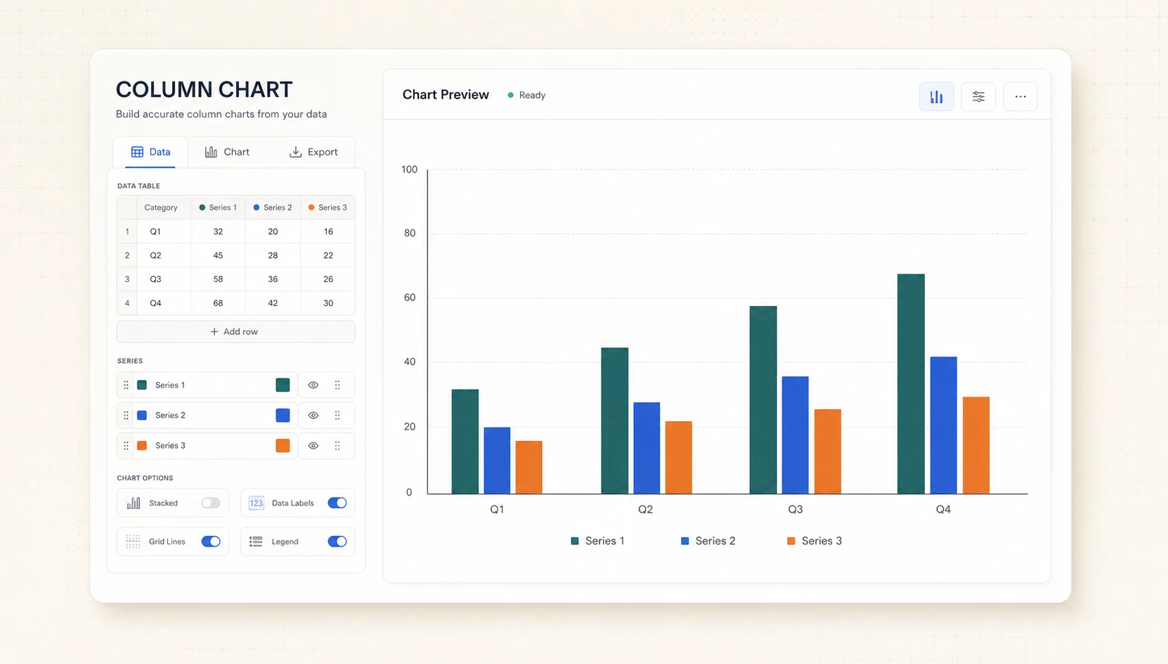
Turn CSV or spreadsheet rows into precise grouped or stacked column charts, then export SVG or PNG for free.
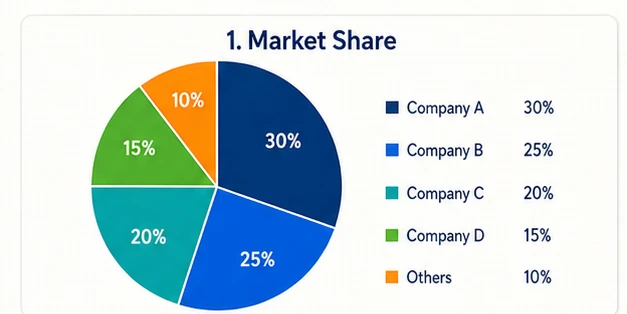
Turn pasted label-and-value rows into an exact Pie or Donut chart with automatic percentages, then export an editable SVG without sign-up.
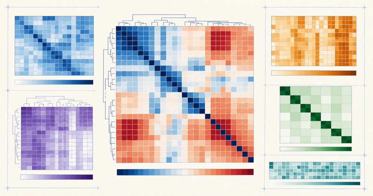
Turn a labeled matrix into an exact color heatmap with values and a shared legend, then export editable SVG or PNG.
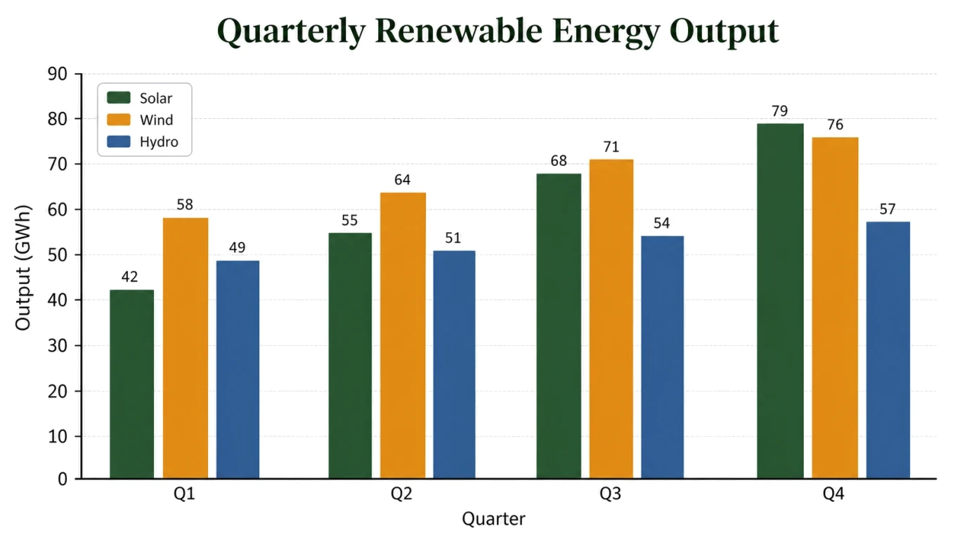
Turn pasted values or a chart brief into an editable visual draft, then review every label, scale, and annotation.
Answers about CSV data, horizontal layouts, grouped and stacked bars, sorting, privacy, and downloads
Paste the data, rank the categories, choose the right layout, and download an editable SVG or PNG in minutes.