





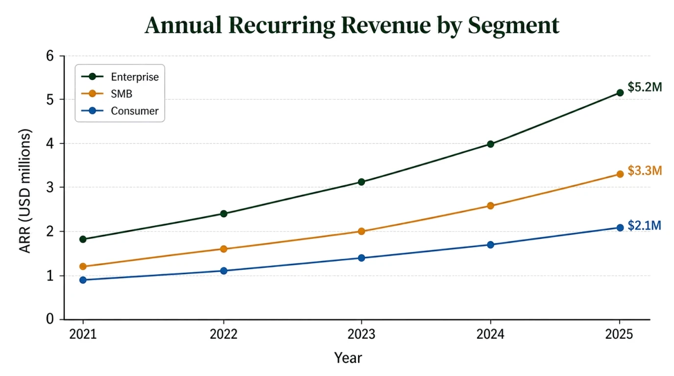
Build Charts for Business Reports
Convert sales, revenue, market-share, survey, or operating metrics into a chart that makes comparison and change easier to review.
Use the AI Chart Generator to paste rows from Excel or CSV, enter text values, or describe a chart. It creates an image-based visual draft that you can refine in FigEditor; it does not directly parse spreadsheet files, and every label, axis, and data point still requires review.
Choose an original chart pattern, replace the sample values with your own pasted data, and check every label, unit, and scale before sharing.
Paste selected spreadsheet rows or structured text to draft a focused chart for a report, research figure, lesson, or presentation without arranging every axis by hand.
Convert sales, revenue, market-share, survey, or operating metrics into a chart that makes comparison and change easier to review.
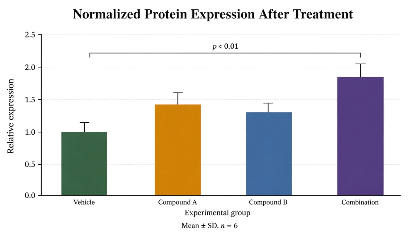
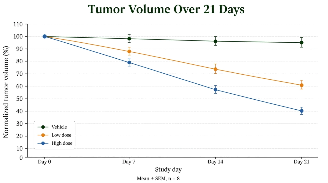
Visualize experimental groups, time series, or correlations, then verify error bars, sample sizes, statistical notes, and every plotted value.
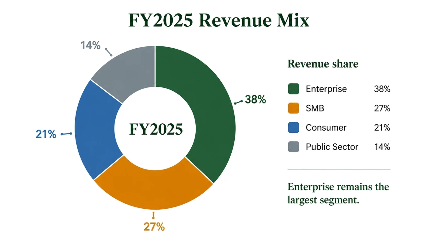
Turn a short list of values into a readable chart for a slide, poster, classroom handout, or stakeholder update.
02Chart workflow
Give the model structured values and a clear comparison goal, then keep every important visual choice open to review in FigEditor.
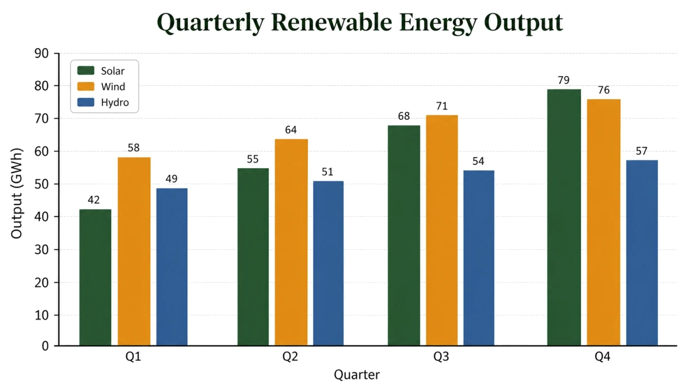
Paste categories, dates, values, units, and the comparison you need from Excel, CSV, or text. Exact labels and a clear chart goal make the result easier to verify.
State the required baseline, axis range, uncertainty, sample size, and verified statistical annotations. Never ask the model to invent missing measurements or significance.
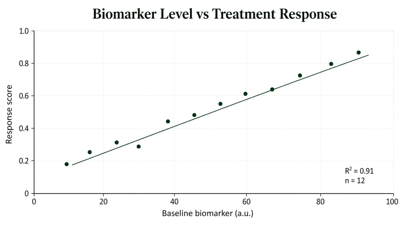
Open the draft in FigEditor and continue with focused revisions to labels, hierarchy, color, spacing, or annotations before export.
A convincing chart can still be wrong. Treat every generated image as a visual draft and compare it with the source before using it in a report, paper, or presentation.
Check each bar, point, line, percentage, category, date, and unit against the data you supplied.
Confirm that the scale does not exaggerate small differences, hide variation, or imply a comparison the source cannot support.
Use error bars, p-values, trend lines, and sample sizes only when those values already come from a valid analysis.
Move from pasted spreadsheet rows or a written brief to a readable chart draft while keeping source review and practical output in view.
Turn structured values into a concrete chart draft before spending time on manual axis setup, labels, legends, and styling.
Faster First Draft
Describe whether readers should compare categories, follow change over time, inspect a relationship, or understand parts of a whole.
Clear Chart Intent
Choose the generation model and resolution while seeing the credit cost before the chart draft is created.
Transparent Credits
Supply the wording and measurements that must stay unchanged, then compare every plotted element with the original source.
Data-Specific Input
Keep the useful composition and make focused changes to labels, annotations, emphasis, color, or layout in FigEditor.
Reviewable Workflow
Verify calculations, axis choices, uncertainty, sample sizes, statistical claims, and visual implications before export.
Human Verification
Paste structured values from Excel, CSV, or text, describe the comparison, then generate and review the chart before using it.
Provide categories or dates, values, units, and any verified uncertainty or sample-size information. This page currently accepts pasted text plus optional image references.
Say whether the visual should compare categories, show a trend, display proportions, or inspect a correlation. Specify the chart type only when you already know what fits.
Compare every mark with the source, check the axis and legend, remove unsupported claims, then continue refining the visual draft in FigEditor.
Continue with a related workflow
Choose a closely related FigEditor tool based on the source material, visual structure, or output you need next.
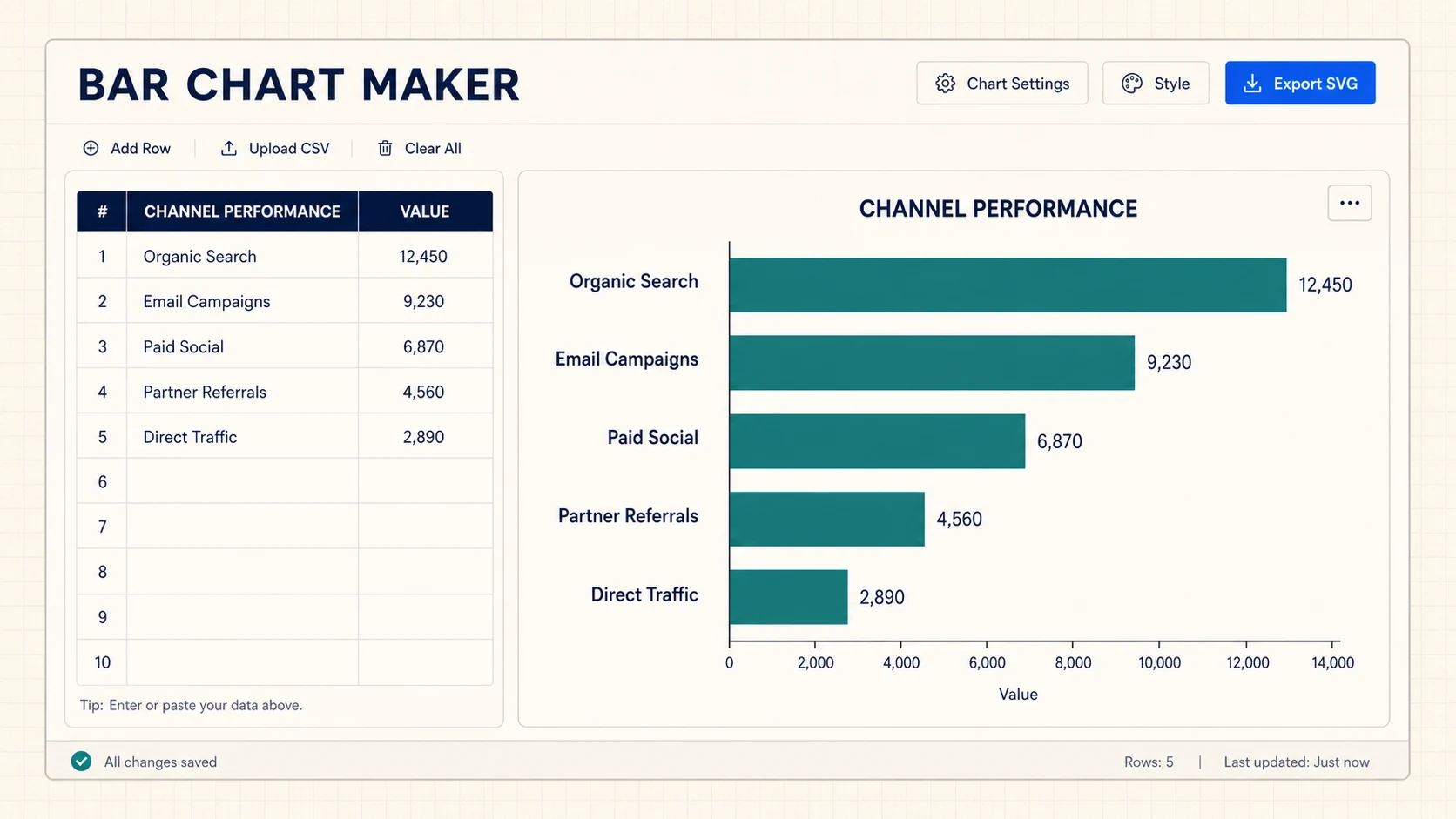
Turn CSV or spreadsheet rows into precise horizontal, grouped, or stacked bar charts, then export SVG or PNG for free.
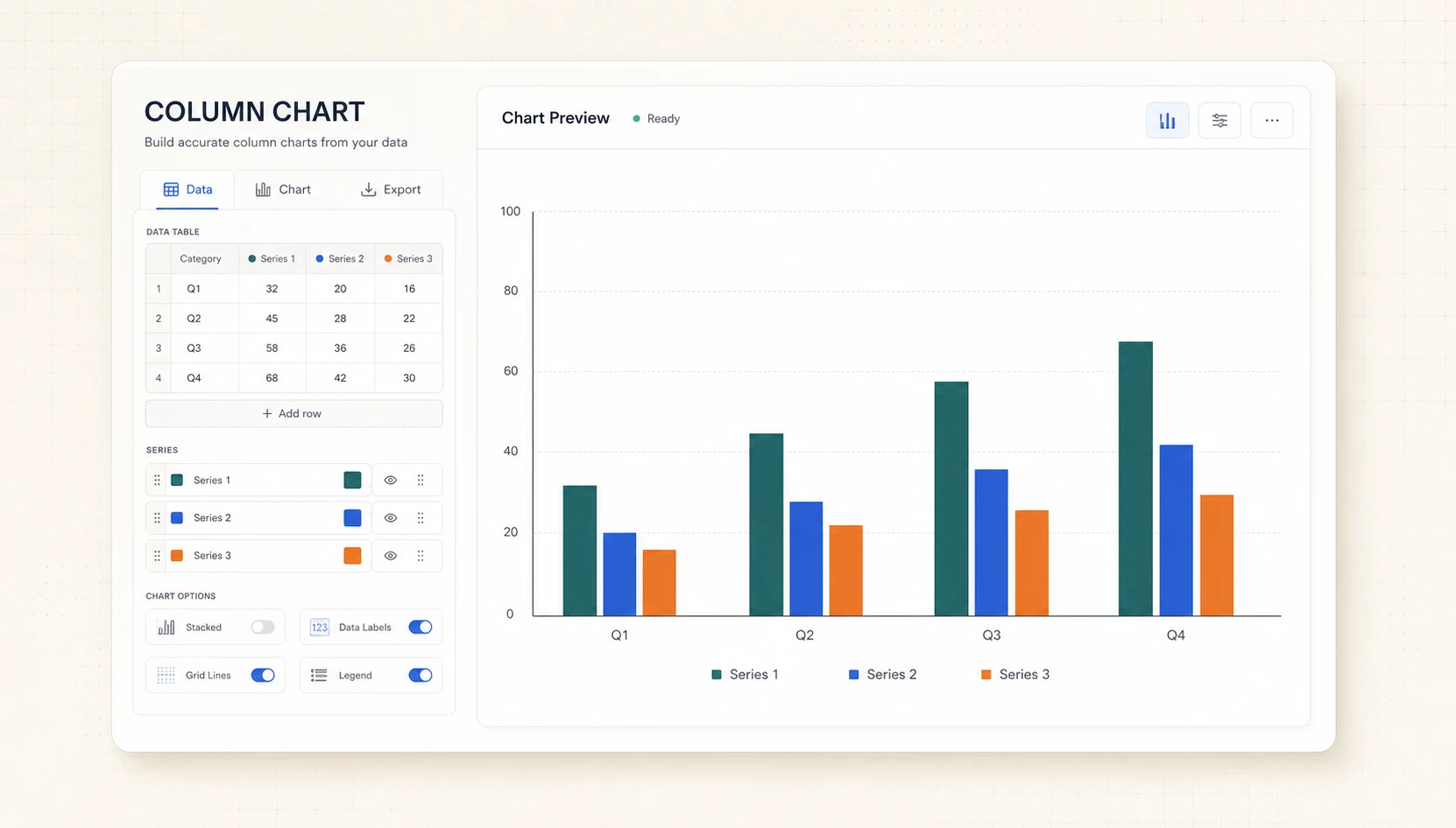
Turn CSV or spreadsheet rows into precise grouped or stacked column charts, then export SVG or PNG for free.
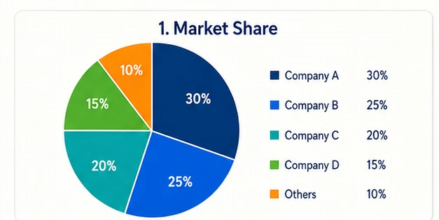
Turn pasted label-and-value rows into an exact Pie or Donut chart with automatic percentages, then export an editable SVG without sign-up.
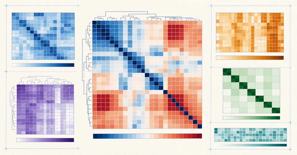
Turn a labeled matrix into an exact color heatmap with values and a shared legend, then export editable SVG or PNG.
Answers about text and data input, chart types, accuracy, editing, statistical plots, and credit use
Use the AI Chart Generator to create a focused visual, verify every value and scale, and continue refining the chart in FigEditor.