
Compare business performance
Scan regions, products, teams, or periods to find clusters of high and low performance.
Use Heatmap Generator to turn a labeled matrix into a readable color map. Compare exact values across rows and columns, switch color scales, and export SVG or PNG directly in your browser.
Start from an accurate matrix example, then replace its labels and values with your own data.
Use a heatmap when the relationship between two categorical dimensions matters as much as each exact value.
Scan regions, products, teams, or periods to find clusters of high and low performance.
Map activity by hour, weekday, cohort, channel, or another repeated dimension.
Visualize relationships among research variables with positive and negative values around zero.
Compare ratings across questions and groups while retaining the underlying scores.
See performance across students, classes, assessments, or curriculum areas in one view.
Visualize expression values, experimental measurements, or coded observations across samples.
Keep matrix input, color scale, exact values, preview, and export in one focused workspace.
Copy rows with the header row and row labels intact.
Upload CSV or XLSX files, or paste comma-, tab-, or semicolon-separated data from Excel, Google Sheets, CSV, or TSV.
Minimum and maximum values define a consistent scale across the full matrix.
Show each numeric cell on top of its color whenever readers need precise lookup as well as pattern recognition.
Use sequential colors for magnitude, diverging colors around a midpoint, or perceptually even Viridis.
Save an editable vector for reports or a ready-to-share bitmap for documents and slides.
Move from raw matrix to presentation-ready visual without rebuilding the data in a full design application.
Every cell color is calculated deterministically from the visible numeric data.
The preview updates as soon as you paste or change the matrix.
The browser-based chart renderer does not need to send the matrix to an image model.
SVG export keeps text, cells, and legend sharp at document, slide, or poster size.
Labels, values, contrast-aware text, and a shared legend keep the visual interpretable.
Switch palettes without re-entering the data or changing the matrix structure.
Paste a labeled matrix, choose a meaningful color scale, then export the heatmap you reviewed.
Step 1
Include column labels in the first row, row labels in the first column, and numeric values in the remaining cells.
Step 2
Use a sequential, diverging, or Viridis scale and decide whether exact values should appear in every cell.
Step 3
Check the minimum, maximum, missing cells, labels, and legend before exporting SVG or PNG.
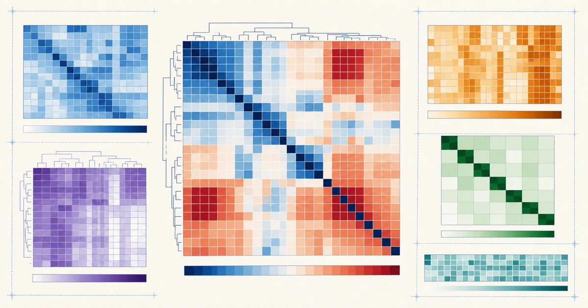
Choose the right visual
Match the visualization to the structure and question in your data.
Choose this tool when repeated row and column categories should expose patterns across both dimensions.
Make a matrix heatmapChoose mapping software when addresses, boundaries, coordinates, or spatial density define the story.
Use a mapping toolChoose an eye-tracking or predictive-attention tool when you need to evaluate where viewers look in an image.
Use an attention toolStart with free credits, subscribe for regular figure creation, or purchase a credit pack for your next paper or presentation.
Continue with a related workflow
Choose a closely related FigEditor tool based on the source material, visual structure, or output you need next.
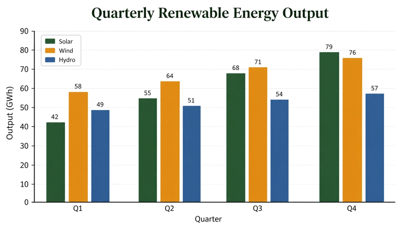
Turn pasted values or a chart brief into an editable visual draft, then review every label, scale, and annotation.
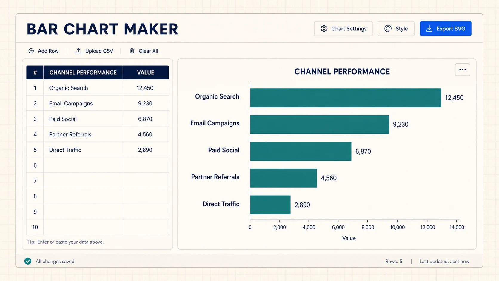
Turn CSV or spreadsheet rows into precise horizontal, grouped, or stacked bar charts, then export SVG or PNG for free.
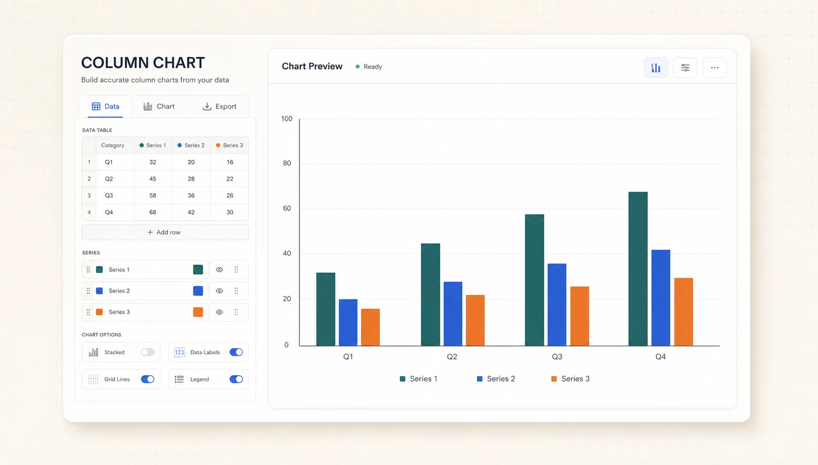
Turn CSV or spreadsheet rows into precise grouped or stacked column charts, then export SVG or PNG for free.
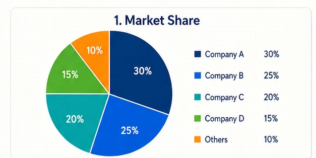
Turn pasted label-and-value rows into an exact Pie or Donut chart with automatic percentages, then export an editable SVG without sign-up.
Answers about matrix format, palettes, correlation heatmaps, exports, and privacy.
Paste the data, choose a color scale, and export an accurate SVG or PNG without signing up.
Paste a labeled matrix to render an exact heatmap in your browser.
Heatmap preview
4 × 4
Every cell uses one shared scale, so colors remain comparable across the entire matrix.
Cancel anytime · Subscription credits are valid for 30 days
For individual researchers creating and refining publication-ready visuals
Included tools & models
Creation tools
 Paper Banana
 AI Scientific Illustration
 Scientific Poster Maker
Image models
 Nano Banana
 Nano Banana 2
 Nano Banana Pro
 GPT Image 2
For frequent research, publishing, and client work with commercial use
Included tools & models
Creation tools
Paper BananaAI Scientific IllustrationScientific Poster MakerImage models
Nano BananaNano Banana 2Nano Banana ProGPT Image 2For labs, teams, and agencies producing scientific visuals at high volume
Included tools & models
Creation tools
Paper BananaAI Scientific IllustrationScientific Poster MakerImage models
Nano BananaNano Banana 2Nano Banana ProGPT Image 2