

Scientific Infographic Design: A Complete Guide for Researchers and Educators
Learn how to plan, design, review, and export accurate scientific infographics with clear layouts, honest data visualization, citations, and accessibility.
On this page
- What Is a Scientific Infographic?
- Scientific Infographic vs. Graphical Abstract vs. Scientific Poster
- Start with the Audience and One Core Message
- Build a Content and Evidence Map
- Choose the Right Scientific Infographic Layout
- Timeline Layout
- Process or Flowchart Layout
- Comparison Layout
- Statistical or Data-Driven Layout
- Geographic Layout
- Hierarchical Layout
- How to Visualize Scientific Data Accurately
- Common Ways Charts Mislead Readers
- Scientific Infographic Design Principles
- Create a Clear Visual Hierarchy
- Use Typography That Survives the Final Size
- Use Color to Explain
- Design for Accessibility
- Use White Space Intentionally
- How to Create a Scientific Infographic Step by Step
- Worked Example: Turning a Research Brief into an Infographic
- Common Uses for Scientific Infographics
- 1. Research Findings
- 2. Experimental Methods
- 3. Education and Teaching
- 4. Public Science Communication
- 5. Social Media Research Communication
- 6. Academic Posters and Conference Presentations
- 7. Graphical Abstracts
- Tools for Creating Scientific Infographics
- How to Cite Sources in a Scientific Infographic
- Export Formats and Final Quality Checks
- Common Scientific Infographic Design Mistakes
- Scientific Infographic Checklist
- Frequently Asked Questions
- What is the difference between a scientific infographic and a graphical abstract?
- What size should a scientific infographic be?
- How many colors should a scientific infographic use?
- How should sources be cited in a scientific infographic?
- Which tools are best for creating scientific infographics?
- How can a scientific infographic be made accessible?
- Conclusion
- Put This Workflow into Practice with FigEditor
Scientific infographic design turns research findings, scientific processes, and complex concepts into visuals that people can understand without losing the evidence behind them. A strong infographic does more than look polished: it gives the reader a clear route through the information, represents data honestly, and makes sources easy to find.
This guide explains how to plan, design, review, and export a scientific infographic for research, education, or public communication. You will also learn when an infographic is the right format—and when a graphical abstract, scientific poster, or conventional figure would serve the reader better.
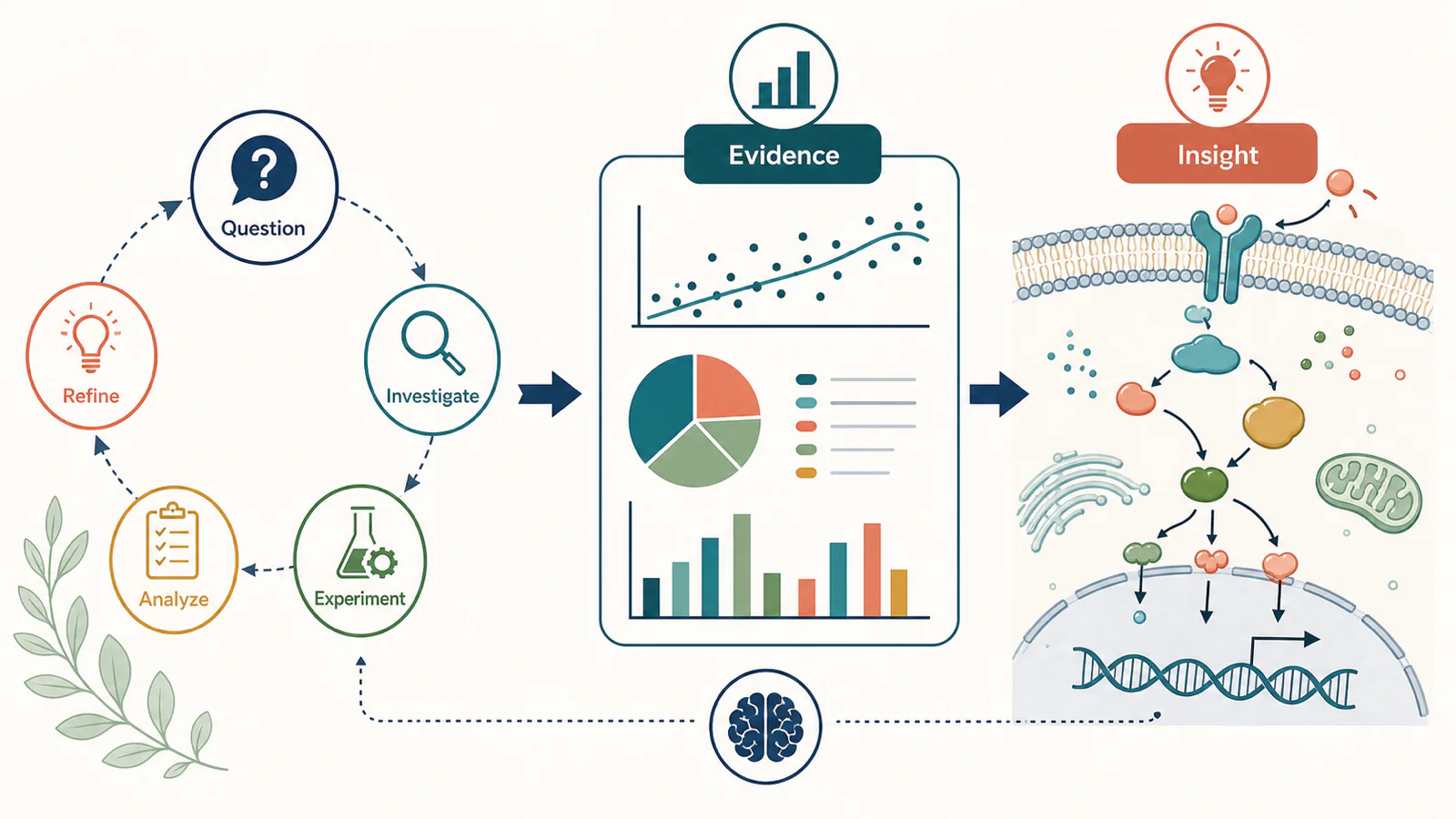
Quick summary
A scientific infographic is a visual explanation built from scientific evidence. It may combine concise text, diagrams, illustrations, charts, maps, or timelines, but every element should support one main message.
The most reliable workflow is simple: identify the audience, define the message, verify the evidence, choose a layout that matches the relationships in the content, build a rough structure, and review the final visual at its actual display size. Design decisions come after those communication decisions—not before them.
What Is a Scientific Infographic?
A scientific infographic combines words and visuals to explain scientific knowledge. It may summarize a field, explain a mechanism, compare methods, show a research workflow, or communicate selected findings.
What makes it scientific is not a collection of laboratory icons or a technical-looking color palette. It is the standard applied to the information:
- Accuracy: Data, labels, scales, and visual relationships must agree with the evidence.
- Clarity: Complex ideas should become easier to follow without losing their scientific meaning.
- Traceability: Readers should be able to find the source behind important claims and datasets.
- Objectivity: The design must not exaggerate certainty, causality, or the size of an effect.
- Audience fit: Language and detail should match what the intended reader already knows.
A marketing graphic may prioritize attention or persuasion. A scientific infographic can still attract attention, but accuracy, context, and source transparency set the limits of the design.
The idea is close to how Rougier, Droettboom, and Bourne describe scientific visualization in their open-access article, “Ten Simple Rules for Better Figures”: a visual is an interface between people and data. That interface succeeds only when the reader can recover the intended meaning.
Scientific Infographic vs. Graphical Abstract vs. Scientific Poster
These formats overlap, but they solve different communication problems. Choosing the right one early prevents you from forcing too much information into a canvas that was designed for another job.
| Format | Primary purpose | Typical scope | Best used when |
|---|---|---|---|
| Scientific infographic | Explain a scientific topic or evidence-based message | One topic, process, comparison, or selected findings | The reader needs a guided visual explanation |
| Graphical abstract | Summarize the central story of one paper | Research question, method or mechanism, and main outcome | A journal, website, presentation, or social post needs a compact paper summary |
| Scientific poster | Present a fuller research project | Background, methods, results, interpretation, and references | A conference audience needs enough detail to discuss the study |
| Scientific figure | Present evidence or a specific part of the study | A plot, image panel, mechanism, workflow, or schematic | The visual must support a precise claim in a paper or presentation |
A graphical abstract is therefore a specialized form of scientific visual communication, not a synonym for every scientific infographic. The practical distinction is scope. An infographic may synthesize a topic or several sources; a graphical abstract normally stays anchored to one paper. The PLOS Computational Biology guide “Ten Simple Rules for Designing Graphical Abstracts” similarly treats the graphical abstract as a compact visual companion to a research work.
Start with the Audience and One Core Message
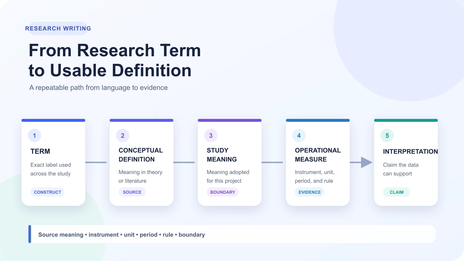
Before you choose colors or open a design tool, write down two sentences:
- This infographic is for: a specific audience.
- After viewing it, they should understand: one main message.
“Researchers” is often still too broad. A domain expert, a first-year student, a patient group, and a policy team can all care about the same subject while needing different terminology and levels of detail.
The CDC Clear Communication Index, developed for public communication materials, begins with the primary audience, communication objective, and main message. Its advice transfers well beyond public health: make the main message obvious, put important information early, and use visual cues to support—not compete with—that message.
Build a Content and Evidence Map
Collect the material before designing it. A small planning table is enough:
| Content item | Role in the story | Visual form | Source required? |
|---|---|---|---|
| Main finding or concept | Core message | Headline and focal visual | Yes, if it is a factual claim |
| Key process or mechanism | Explanation | Flow or schematic | Usually |
| Quantitative evidence | Support | Chart or annotated number | Yes |
| Context or limitation | Qualification | Short note or callout | Yes when factual |
| Reader action | Next step | Closing instruction | Depends on context |
This map forces useful decisions. If an item does not support the main message, move it to a caption, supporting resource, or a separate infographic. Removing information is often the hardest—and most valuable—part of the process.
Choose the Right Scientific Infographic Layout
The layout should reflect the relationships in the content. A timeline implies chronology. A flowchart implies sequence or causality. A side-by-side comparison implies that both sides are being judged against the same criteria.
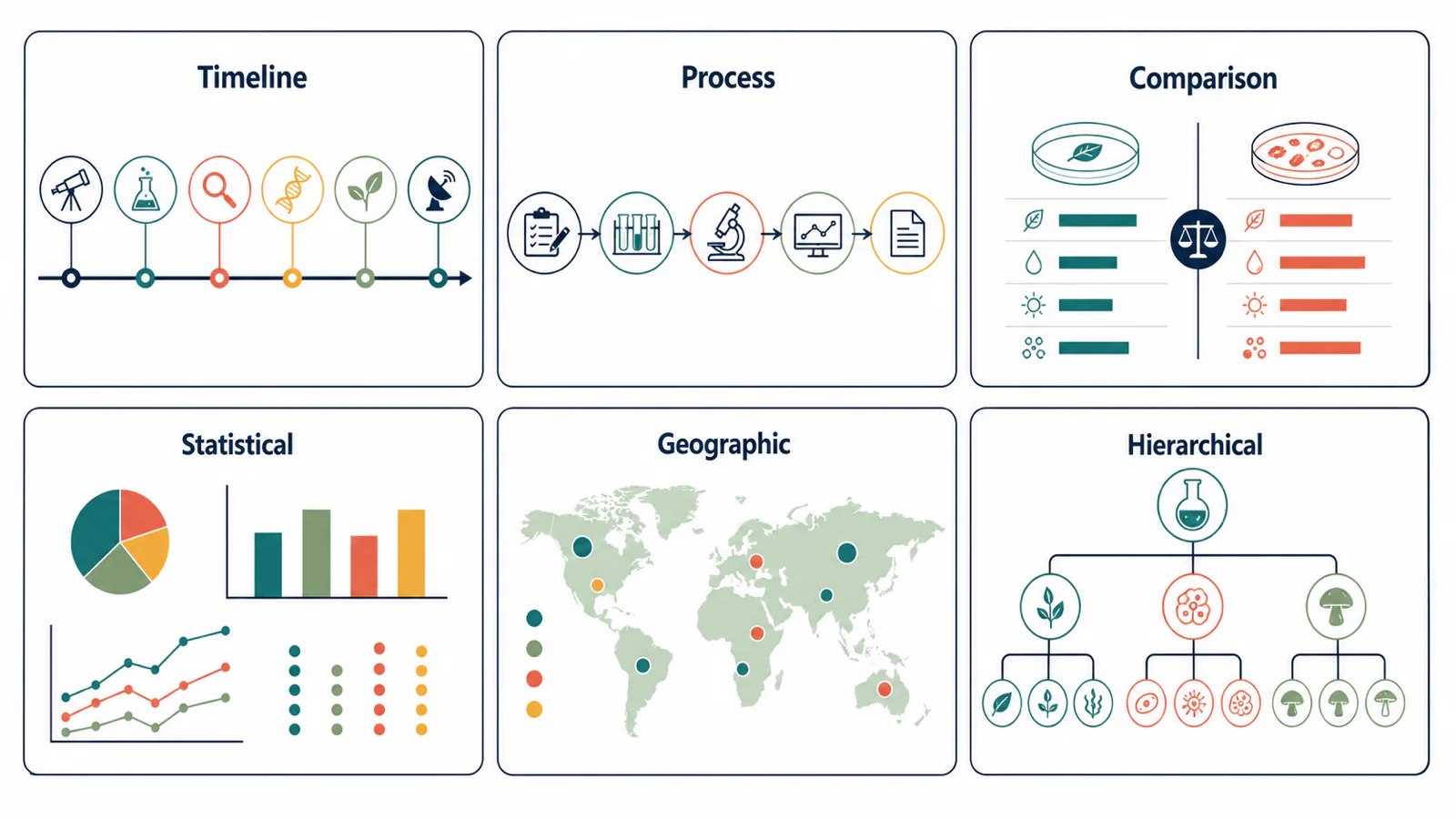
Timeline Layout
Use a timeline when order and change over time are central to the explanation.
- Best for: research milestones, technology development, clinical-trial phases, or an evolving scientific model.
- Watch out for: keep intervals proportionally honest when the spacing represents time; otherwise label the sequence as stages rather than implying a measured time scale.
Process or Flowchart Layout
Use a flowchart for anything with a defined sequence or causality.
- Best for: experimental methods, biological mechanisms, decision pathways, and analytical pipelines.
- Watch out for: every arrow should have a defensible meaning. If one arrow means "causes," do not reuse the same style elsewhere to mean "is followed by" or "is transferred to."
Comparison Layout
Use a comparison layout when readers need to evaluate options against the same criteria.
- Best for: comparing methods, treatments, organisms, models, or states.
- Watch out for: define the criteria first, then apply them to every option. An uneven comparison—cost on one side, accuracy on the other—creates visual symmetry without analytical fairness.
Statistical or Data-Driven Layout
Give charts the visual center when the evidence is the story.
- Best for: survey results, experimental outcomes, trends, and any claim that depends on a number.
- Watch out for: the surrounding text should explain what to look for and what the data cannot establish. Do not reduce a result to a large percentage if the denominator, sample, time frame, or uncertainty changes its meaning.
Geographic Layout
Use a map when the question is about where something occurs.
- Best for: spatial distribution, migration, environmental patterns, public-health surveillance, and regional comparisons.
- Watch out for: include the geographic unit, legend, time period, and source. Larger regions can dominate a map visually even when area is not the variable being compared.
Hierarchical Layout
Use a hierarchy to show how things nest, classify, or rank.
- Best for: taxonomies, nested concepts, organizational structures, and levels of biological or theoretical organization.
- Watch out for: hierarchies are not processes—connecting two boxes vertically does not automatically mean one happens before the other.
How to Visualize Scientific Data Accurately
Choose a chart by the analytical question, not by how visually distinctive it looks. The same dataset can support very different visual impressions, which is why chart selection and scale decisions need as much care as the statistical analysis.
Before building any chart, lock in four things:
- The question — comparison, trend, distribution, relationship, or composition.
- The chart type — matched to that question, not to what looks striking.
- The context — sample size, units, time frame, and uncertainty.
- The honest encoding — baselines, ranges, and color that do not mislead.
| Question | Useful starting points | Check before publishing |
|---|---|---|
| How do categories compare? | Dot plot, bar chart | Does the baseline and ordering support honest comparison? |
| How does a measure change over time? | Line chart | Are intervals and missing periods clear? |
| How are values distributed? | Histogram, box plot, violin plot, raw points | Is the sample size visible or stated? |
| Are two variables related? | Scatter plot | Are overplotting and influential observations addressed? |
| How do parts contribute to a whole? | Stacked bar, carefully limited pie or donut chart | Do the parts share one meaningful total? |
| Where does something occur? | Point map, choropleth, density map | Is the geographic denominator appropriate? |
The peer-reviewed review “Principles of Effective Data Visualization” recommends deciding the message before building the visual and matching color and visual form to the information being communicated. That does not mean hiding inconvenient data. It means deciding which question the graphic is answering, then preserving the context needed to judge the answer.
Common Ways Charts Mislead Readers
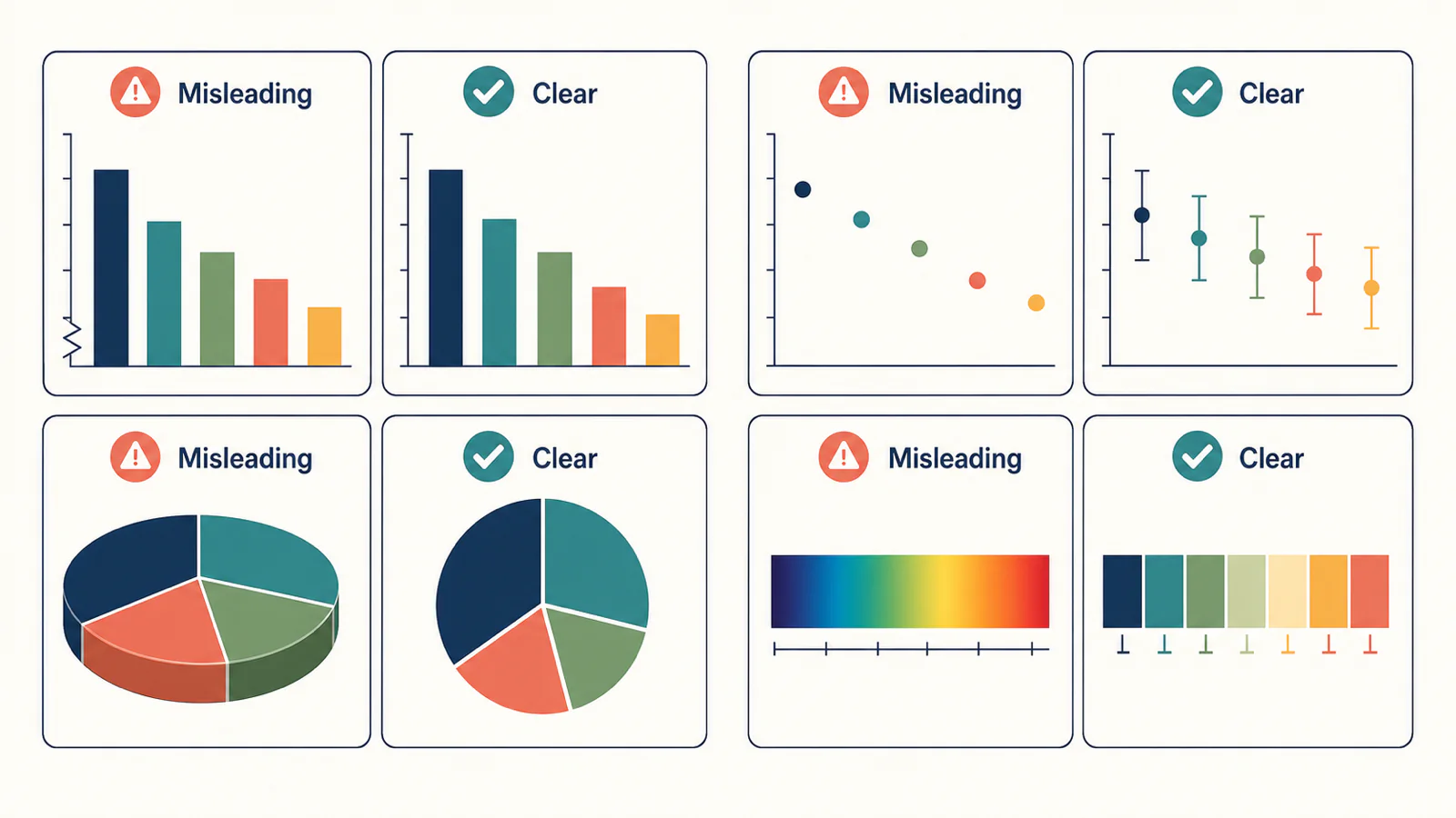
- A distorted baseline: Bar length encodes magnitude, so a truncated axis can exaggerate small differences. Other chart types may legitimately use a non-zero range, but the scale should be explicit.
- Missing uncertainty: A mean without variation, interval estimates, or raw observations can hide how stable the result is.
- Decorative dimension: 3D bars and tilted pie charts alter apparent size without adding information.
- Selective range: Cropping the time span or category set can create a trend that disappears in fuller context.
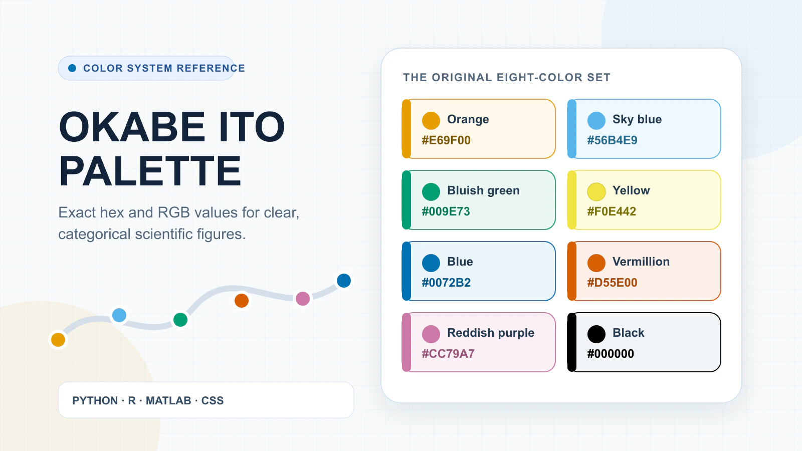
- Color that implies the wrong structure: A rainbow sequence can suggest arbitrary boundaries and is difficult for many readers to interpret.
When a chart carries an important claim, include the sample size, units, time frame, and source either in the visual or in a caption that will travel with it.
Scientific Infographic Design Principles
Good visual design makes the evidence easier to inspect. It does not decorate weak evidence or replace missing context.
Five principles keep a scientific infographic legible and honest:
- Visual hierarchy — decide what the reader notices first.
- Typography — keep labels readable at the final display size.
- Color — give every color a defined job, and never rely on color alone.
- Accessibility — meet contrast standards and provide text alternatives.
- White space — separate groups instead of shrinking text to fit.
Create a Clear Visual Hierarchy
Give the reader an obvious order to follow:
- First: the main message or result.
- Next: the evidence, mechanism, or comparison that explains it.
- Last: supporting detail, limitations, and sources.
Use position, scale, contrast, and spacing to reinforce that order. If five elements are equally large and saturated, none of them is truly emphasized.
Use Typography That Survives the Final Size
Test typography where readers will actually see it:
- Preview journal graphics at thumbnail size.
- Print handouts at their real physical dimensions.
- View presentation slides from the back of the room.
- Keep technical symbols intact and essential explanations out of tiny labels.
A label that looks comfortable on a large editing canvas can disappear completely in the final format.
Use Color to Explain
Assign every color a clear job:
- Group related categories.
- Show direction or progression.
- Distinguish experimental conditions.
- Highlight the one result that needs attention.
Keep each meaning consistent. Bang Wong's Nature Methods article on color blindness in scientific graphics demonstrates why red–green distinctions alone can fail. Combine color with direct labels, line styles, shapes, or patterns so the information does not depend on color perception alone.
Design for Accessibility
For digital publication, check more than color contrast:
- Provide descriptive alternative text or an equivalent explanation.
- Keep the reading order understandable without relying on spatial guesswork.
- Pair color with labels, shapes, patterns, or line styles.
- Inspect the final exported image for small or blurred text.
WCAG 2.2 sets a minimum contrast ratio of 4.5:1 for normal text and 3:1 for large text at Level AA, with defined exceptions. These thresholds are a starting point, not a substitute for testing the complete graphic.
Use White Space Intentionally
Use white space to:
- Separate one idea from the next.
- Show which labels belong to which visual elements.
- Create breathing room around the main result.
- Prevent the page from becoming one uninterrupted block.
If a design feels crowded, remove repetition and secondary decoration first. Shrinking all the text is rarely the right fix.
How to Create a Scientific Infographic Step by Step
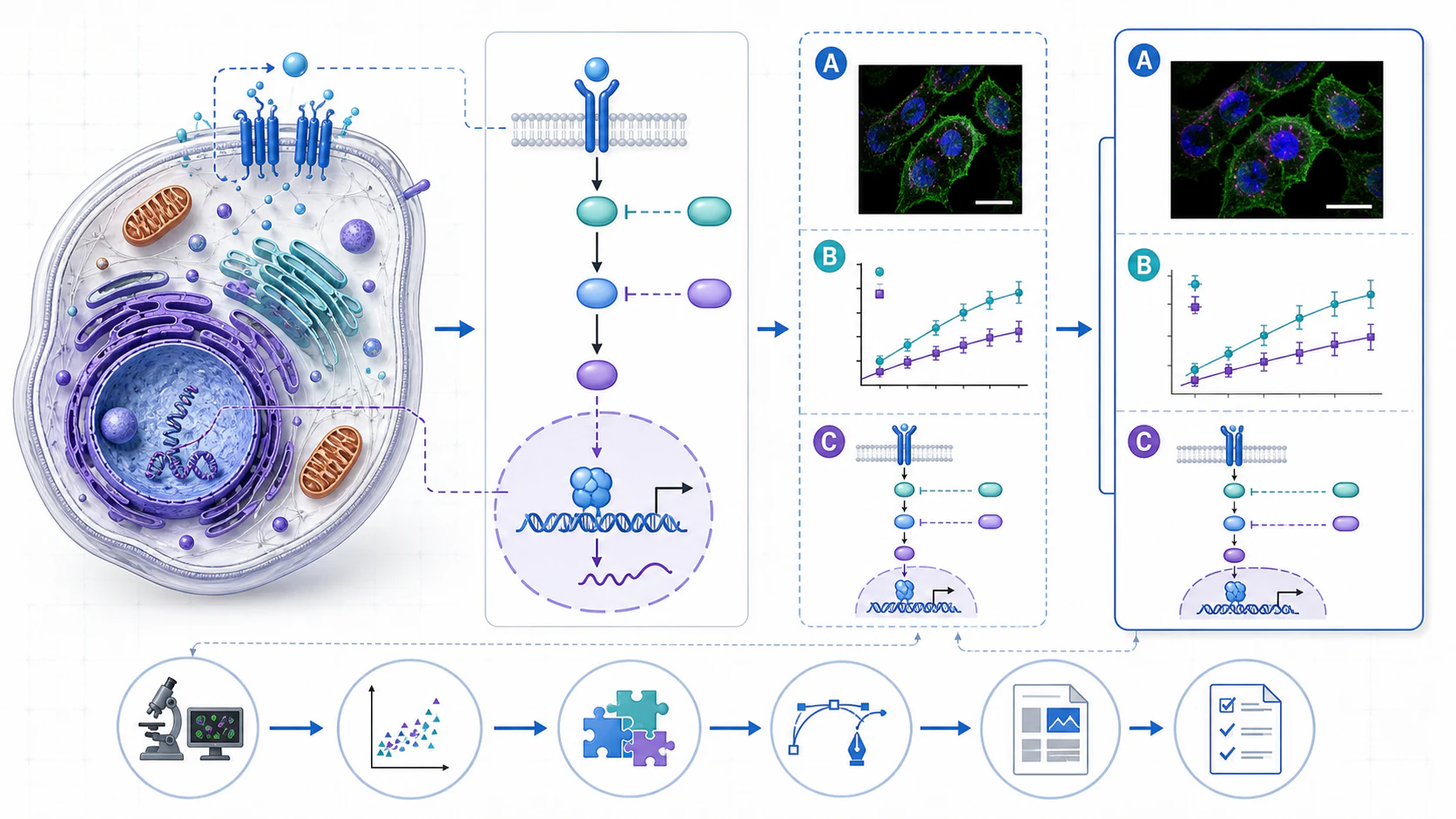
The most efficient workflow delays visual polish until the scientific structure is stable. This reduces rework and makes review comments easier to interpret.
- Define the audience and destination. Record who will see the infographic, where it will appear, and what they should learn or do.
- Write the main message. Use one complete sentence. If it requires several “and” clauses, the scope is probably too broad.
- Gather and verify the evidence. Collect data, source links, citations, terminology, and limitations before compressing them.
- Select the content. Separate what the reader must know from what would merely be interesting to include.
- Choose the visual structure. Match the layout to chronology, sequence, comparison, hierarchy, geography, or quantitative evidence.
- Sketch a low-fidelity wireframe. Use plain boxes and arrows to test reading order before investing in illustration.
- Build and review the visual. Create charts, diagrams, labels, and citations; then check accuracy, accessibility, and interpretation with another reader.
- Export for the real use case. Test the file in the journal system, slide deck, web page, learning platform, or print workflow where it will be used.
Review is not a final cosmetic step. Ask a subject expert to check the science and someone closer to the target audience to explain what they think the infographic says. A technically correct visual can still communicate the wrong message if the reading path is unclear.
Worked Example: Turning a Research Brief into an Infographic
Consider an illustrative research brief about the relationship between urban tree cover and daytime surface temperature. This example describes a communication structure, not real study findings, so it deliberately avoids invented numbers.
The raw material might include the research question, satellite temperature measurements, a canopy-cover dataset, neighborhood boundaries, an analysis method, several maps, multiple plots, and a list of limitations. Putting all of that on one canvas would reproduce the project, not explain it.
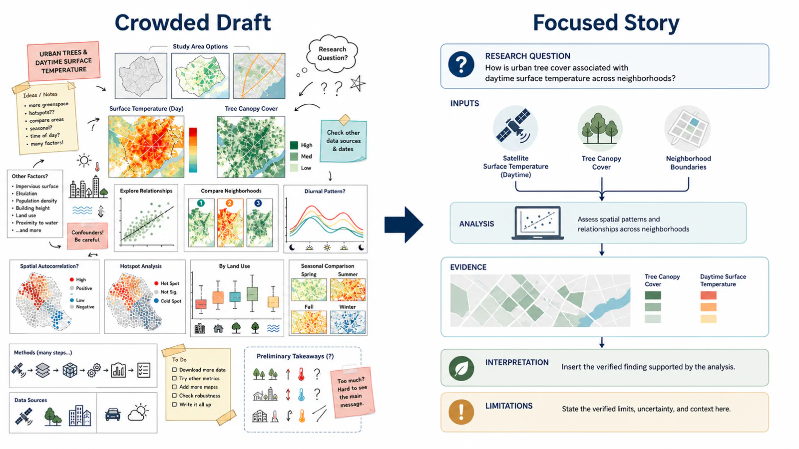
A clearer infographic could use this reading path:
- Question: How is tree cover evaluated alongside daytime surface temperature?
- Inputs: Satellite-derived temperature, canopy-cover data, and geographic units.
- Method: Align the spatial data, define comparison units, and analyze the relationship.
- Evidence area: Reserve space for the verified map and plot produced from the actual analysis.
- Interpretation: State only the conclusion supported by those results.
- Limitations: Note relevant temporal, spatial, or measurement constraints.
- Sources: Cite the datasets, method, and full study or report.
The visual improvement comes from deciding what the reader needs—not from adding more icons. In a real project, the evidence area must be populated with the actual analysis and reviewed against the source material.
Common Uses for Scientific Infographics
Different use cases deserve different levels of detail. Reusing one template across all of them usually produces a graphic that is either too dense for the public or too shallow for a specialist audience.
| Use case | Lead with | Detail level |
|---|---|---|
| Research findings | The question and one supported result | Enough on sample, method, and uncertainty to interpret it |
| Experimental methods | Sequence, inputs, and outputs | Quantities and timings that affect reproducibility |
| Education and teaching | A simplified model or system | Matched to the learning objective; flag what is simplified |
| Public communication | The main message, early | Fewer variables, more context; never erase uncertainty |
| Social media | One message at small size | Source and author embedded, since the post may not travel with it |
1. Research Findings
Use a research findings infographic to communicate one supported result without asking readers to decode the full paper first.
- Lead with the research question and the result that answers it.
- Include the sample, method, and uncertainty needed to interpret the result.
- Link to the paper, dataset, preprint, or report when available.
2. Experimental Methods
Use a methods infographic when the sequence or transformation is easier to understand visually than in a paragraph.
- Show the inputs, steps, controls, branches, and outputs.
- Give every arrow one consistent meaning.
- Preserve quantities and timings that affect reproducibility.
3. Education and Teaching
Teachers and course creators can use scientific infographics to:
- Explain processes such as photosynthesis or cell division.
- Compare related concepts, models, or systems.
- Summarize a large topic for review.
- Create study materials around a specific learning objective.
Match terminology to students' prior knowledge, and state when the visual is a simplified model rather than a literal depiction.
4. Public Science Communication
Science journalists, museums, public-health teams, and outreach organizations can use infographics to:
- Make research findings accessible to non-specialists.
- Explain health guidance and risk.
- Communicate environmental or policy issues.
- Help readers build scientific literacy.
Define technical terms and present the main message early, but do not erase uncertainty or convert association into causation.
5. Social Media Research Communication
Design social graphics for the conditions in which they will be seen:
- Keep the graphic readable on a small screen.
- Communicate one main message per image or slide.
- Embed the source, author, or institution in the visual.
- Include enough context for the image to remain accurate when shared without the original post.
6. Academic Posters and Conference Presentations
A scientific infographic can become the visual backbone of a conference poster or one self-contained panel within it.
- Lead with the question and the result viewers should remember.
- Connect methods, evidence, and interpretation in a clear reading path.
- Keep essential labels readable from several feet away.
- Provide a DOI or QR code for the full paper, data, or protocol.
Do not use the infographic to hide information the audience needs to evaluate the study. Retain relevant details about the sample, controls, uncertainty, limitations, and references.
7. Graphical Abstracts
Use a graphical abstract when readers need a compact introduction to one paper.
- Show the research question, main method or mechanism, and supported outcome.
- Follow the target journal's dimensions and file requirements.
- Keep the scope narrower than a general scientific infographic.
- Avoid claims that do not appear in the paper.
The visual should help readers decide whether to read the full study—not reproduce every result on one canvas.
Tools for Creating Scientific Infographics
No single tool is best for every stage. Choose a stack based on the work that needs to remain reproducible and the work that needs to remain editable.
- Data analysis and charts: R, Python, spreadsheet software, and statistical packages are useful when plots must stay connected to data or code.
- Scientific diagrams and illustrations: Domain-specific libraries, diagram editors, and AI-assisted scientific figure tools can help with mechanisms, workflows, and explanatory visuals. Generated scientific content still requires human verification.
- Layout and assembly: Figma, Illustrator, InDesign, Canva, and presentation software provide different balances of control, collaboration, templates, and learning curve.
- Maps: GIS software and reproducible mapping libraries are better suited to spatial projections, joins, legends, and geographic data than a general page-layout tool.
- Review and editing: Prefer a workflow that keeps text, labels, charts, and visual structure editable until the scientific review is complete.
If you are turning one paper into a compact visual story, a dedicated graphical abstract maker can provide a starting structure. For a broader figure, mechanism, or workflow, FigEditor supports scientific figure generation and continued revision. Treat any generated output as a draft and verify every label, relationship, value, and claim.
How to Cite Sources in a Scientific Infographic
An infographic needs citations wherever the reader would otherwise have to trust an unsupported factual claim, dataset, adapted visual, or quotation. The exact reference style depends on the venue, but the traceability requirement does not.
The practical rules are simple:
- Place markers near the claim — short superscripts or tags, not a wall of references at the bottom.
- Keep a compact source list — attach it to the graphic so it travels when shared.
- Use persistent links — DOIs for digital versions; record dataset versions or access dates.
- Check licenses, not just citations — a citation does not grant permission to reuse an image.
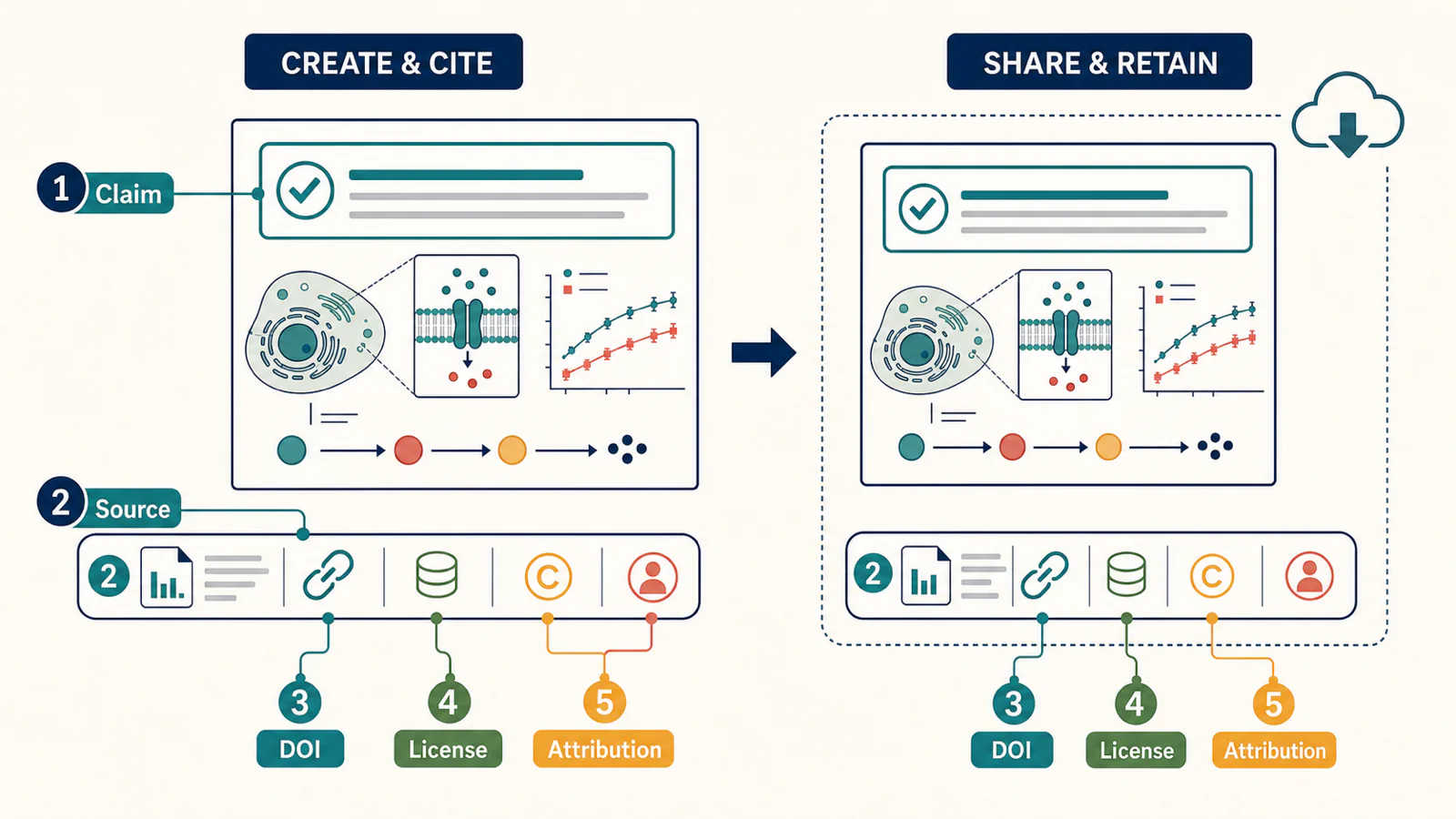
Use short reference markers near claims or charts, then provide a compact source list. For digital graphics, include persistent links or DOIs when possible. For web datasets, record the dataset version or access date if the content changes over time. If you adapt an existing figure, check both the license and the attribution requirements; a citation alone does not automatically grant permission to reuse an image.
Keep the source list attached to the infographic. A reference that exists only in a surrounding social post or slide note can disappear when the image is downloaded and shared elsewhere.
Export Formats and Final Quality Checks
Choose the final format from the destination requirements rather than from a universal “best format.”
- PNG: widely useful for web pages, slides, learning platforms, and social posts; test compression and pixel dimensions.
- SVG: useful for scalable diagrams and continued editing when the destination accepts it; inspect whether text and objects remain structured.
- PDF: useful for print and layout-preserving distribution; embed fonts and check whether images were downsampled.
- TIFF, EPS, JPEG, or office files: may be requested by publishers or production systems. Follow the target journal's current author instructions.
Publisher requirements vary by journal and by artwork type. Elsevier's current artwork overview, for example, distinguishes vector, bitmap, and halftone workflows and recommends several submission formats. That guidance should not be generalized to every publisher. Always check the target journal, conference, printer, or platform before export.
Before delivery, inspect the infographic at its final physical or on-screen size. Check spelling, symbols, units, legends, arrow direction, data labels, citations, contrast, alt text, and the accuracy of every visual relationship.
Common Scientific Infographic Design Mistakes
- The topic is too broad. The visual becomes a compressed report rather than a guided explanation.
- The main message is missing. Readers see several facts but cannot tell which one matters.
- The chart does not match the question. A visually familiar chart replaces a more informative representation.
- Decoration suggests evidence. Icons, arrows, or colors imply causal or quantitative relationships that the research did not establish.
- Text becomes unreadable. The design works on the editing canvas but fails at publication size.
- Sources are detached from claims. Readers cannot trace the data or the graphic after it is shared.
- Color carries the entire meaning. The visual fails for color-vision differences, grayscale printing, or low-quality projection.
- The infographic is never tested. The author verifies the science but not what the intended audience actually understands.
Scientific Infographic Checklist
Before publishing, confirm that:
- The target audience and main message are explicit.
- Every factual claim and dataset has a traceable source.
- The visual form matches the relationship in the content.
- Charts include the context needed for interpretation.
- Arrows, colors, icons, and spatial position do not imply unsupported relationships.
- Labels, symbols, units, and terminology are correct.
- Text remains readable at the final display size.
- Color is supported by labels, shapes, patterns, or line styles.
- Alternative text or an equivalent description is available for digital use.
- Permissions and attribution requirements have been checked.
- The export format matches the destination requirements.
- A subject expert and a representative reader have reviewed the result.
Frequently Asked Questions
What is the difference between a scientific infographic and a graphical abstract?
A scientific infographic can explain a broad scientific topic, synthesize several sources, or present selected evidence. A graphical abstract usually summarizes the central story of one research paper in a compact image. Journal definitions and specifications vary, so authors should check the target publication.
What size should a scientific infographic be?
There is no universal size. Design for the final destination: journal thumbnail, website, slide, handout, poster, or social platform. Confirm the required dimensions and file type before building the final layout, then test legibility at that size.
How many colors should a scientific infographic use?
Use only as many colors as the information structure needs. A small, consistent palette is often easier to interpret than many unrelated colors. More important than the number is whether each color has a defined meaning and whether the content remains understandable without color alone.
How should sources be cited in a scientific infographic?
Place short reference markers near the relevant claims or charts and include a compact source list on the graphic. Use DOIs or persistent links for digital versions when available. Also check licenses and permissions for any adapted or reused visual material.
Which tools are best for creating scientific infographics?
The best workflow often combines tools: data or statistical software for reproducible charts, diagram or illustration tools for explanatory visuals, and a layout editor for assembly. Choose tools that preserve the elements you expect to revise and that produce the formats required by the destination.
How can a scientific infographic be made accessible?
Use clear reading order, descriptive labels, adequate contrast, and alternative text. Do not use color as the only signal; combine it with direct labels, shapes, patterns, or line styles. Test the final exported image, not only the editable source.
Conclusion
Scientific infographic design begins with editorial judgment: who the reader is, what they need to understand, and which evidence supports that message. Layout, charts, typography, color, and illustration should make those decisions visible rather than compete with them.
Start with one sentence that states the audience and one sentence that states the main message. Once those are stable, the design becomes a sequence of testable choices instead of a search for decoration.
Put This Workflow into Practice with FigEditor
Once your audience, evidence, and reading order are clear, FigEditor can help you turn that plan into a scientific figure you can keep revising. Start from methods text, figure captions, paper excerpts, sketches, or reference images instead of rebuilding the story from a blank canvas.
Use FigEditor when you need to:
- Create a first visual draft from your research material.
- Edit labels, arrows, nodes, colors, and layout in a structured SVG workflow.
- Save versions as coauthors or reviewers request changes.
- Continue the same visual work into a paper, presentation, or scientific poster.
Generated figures should still be treated as drafts. Check every label, value, relationship, citation, and scientific claim against your source material before publication.
Ready to create yours? Create your scientific figure in FigEditor.