

Okabe Ito Palette: Exact Colors and Accessible Usage Guide
Use this Okabe Ito palette reference to copy all 8 hex and RGB values, add them in Python, R, MATLAB, and CSS, and check accessibility limits.
On this page
- Quick Answer: What Is the Okabe Ito Palette?
- The eight colors at a glance
- What the palette does and does not guarantee
- Okabe Ito Color Palette Hex Codes, RGB Values and Names
- Copy-ready color table
- A practical plotting order
- Background and yellow visibility
- By the Numbers
- Where the Okabe Ito Color Palette Came From
- Okabe and Ito's Color Universal Design guidance
- Why it is sometimes called the Wong palette
- The eight-color original and software variants
- Glossary
- How to Use Okabe Ito Colors in Python, R, MATLAB and CSS
- Python with Matplotlib
- Python with Seaborn
- R with base graphics and ggplot2
- MATLAB with colororder
- CSS custom properties
- Which implementation is actually built in
- When to Use the Palette in Charts and Scientific Figures
- Categorical data versus sequential data
- Lines, bars, points, diagrams and heatmaps
- Use the Okabe Ito palette in three steps
- Accessibility Limits and Checks Before You Publish
- Do not rely on color alone
- Check contrast and light colors
- Test grayscale without promising grayscale safety
- What to do with more than eight categories
- Frequently Asked Questions
- Is the Okabe Ito palette colorblind safe for scientific figures?
- Why is the Okabe Ito color palette also called the Wong palette?
- Is the Okabe Ito palette built into ggplot2 or base R?
- How should I use the Okabe Ito palette with more than eight categories?
- Does the Okabe Ito palette work in grayscale?
- Should Okabe Ito yellow be used on a white background?
- What is the difference between the original and extended Okabe Ito palette?
- Conclusion: Use the Okabe Ito Palette as a System, Not a Guarantee
- References
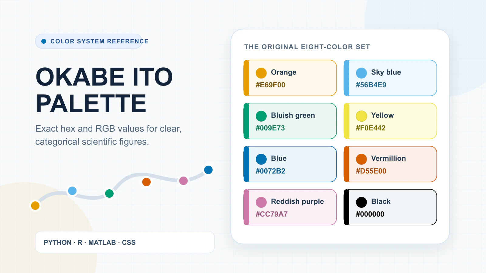
The original Okabe Ito palette contains eight colors: orange #E69F00, sky blue #56B4E9, bluish green #009E73, yellow #F0E442, blue #0072B2, vermillion #D55E00, reddish purple #CC79A7, and black #000000. Use it for categorical data, not continuous magnitude, and never rely on color alone.
Key takeaways
- Use the eight-color set for categories, not continuous values.
- Keep the exact hex and RGB values consistent across tools.
- Pair color with labels, shapes, patterns, or line styles.
- Check yellow and other light colors against the actual background.
- Use documented extension packages instead of inventing built-in APIs.
- Switch strategy when the figure needs more than eight categories.
Quick Answer: What Is the Okabe Ito Palette?
The Okabe-Ito palette is an eight-color qualitative set for distinguishing categories in figures: orange, sky blue, bluish green, yellow, blue, vermillion, reddish purple, and black. Its original values appear in Okabe and Ito's Color Universal Design guidance, first published in 2002 and updated in 2008, for figures intended to remain readable to people with color-vision deficiencies. (Okabe & Ito, 2008)
Use the okabe ito palette when one hue represents one category, such as a treatment group, species, or experimental condition. It is not a sequential scale for low-to-high measurements or a diverging scale built around a midpoint. (EasyStats, 2026; Okabe & Ito, 2008) That distinction matters more than the choice of plotting library.
The eight colors at a glance
The table gives the original okabe ito palette sequence, with decimal RGB values ready to copy into chart, design, or CSS workflows. (Okabe & Ito, 2008)
| Color | Hex | RGB |
|---|---|---|
| Orange | #E69F00 | 230, 159, 0 (Okabe & Ito, 2008) |
| Sky blue | #56B4E9 | 86, 180, 233 (Okabe & Ito, 2008) |
| Bluish green | #009E73 | 0, 158, 115 (Okabe & Ito, 2008) |
| Yellow | #F0E442 | 240, 228, 66 (Okabe & Ito, 2008) |
| Blue | #0072B2 | 0, 114, 178 (Okabe & Ito, 2008) |
| Vermillion | #D55E00 | 213, 94, 0 (Okabe & Ito, 2008) |
| Reddish purple | #CC79A7 | 204, 121, 167 (Okabe & Ito, 2008) |
| Black | #000000 | 0, 0, 0 (Okabe & Ito, 2008) |
Keeping the original sequence explicit prevents a quiet mismatch with software variants. Base R's named implementation adds gray and can place black first, while some extension packages use a different yellow. (EasyStats, 2026; R Core Team, 2026) For reproducible work, store the chosen values in the figure source rather than relying on a package name alone.
What the palette does and does not guarantee
The color set was designed to improve category discrimination for viewers with common color-vision deficiencies. (Okabe & Ito, 2008) It does not guarantee that every pair remains distinct in grayscale, that light colors contrast against white, or that color-coded meaning is accessible without another cue. (Okabe & Ito, 2008; World Wide Web Consortium, 2024)
Important: Pair the palette with direct labels, marker shapes, line styles, patterns, or boundaries. W3C guidance requires information not to depend on color alone, so the palette is one part of an accessible figure rather than a pass/fail certificate. (World Wide Web Consortium, 2024)
Before publication, inspect the finished figure at its actual size and background. Thin yellow lines deserve particular scrutiny on white, and monochrome output should preserve meaning through labels or other redundant encoding. (Okabe & Ito, 2008)
Okabe Ito Color Palette Hex Codes, RGB Values and Names
The Okabe Ito palette contains 8 categorical colors encoded as sRGB hex values and decimal RGB triplets: orange, sky blue, bluish green, yellow, blue, vermillion, reddish purple and black. Use the values consistently across tools, but treat their source sequence as a reference list rather than a universal plotting order. (Okabe & Ito, 2008)
Copy-ready color table
The table preserves the original eight-color set. Each RGB triplet lists red, green and blue channel values in that order.
| Color name | Hex | RGB |
|---|---|---|
| Orange | #E69F00 | 230, 159, 0 (Okabe & Ito, 2008) |
| Sky blue | #56B4E9 | 86, 180, 233 (Okabe & Ito, 2008) |
| Bluish green | #009E73 | 0, 158, 115 (Okabe & Ito, 2008) |
| Yellow | #F0E442 | 240, 228, 66 (Okabe & Ito, 2008) |
| Blue | #0072B2 | 0, 114, 178 (Okabe & Ito, 2008) |
| Vermillion | #D55E00 | 213, 94, 0 (Okabe & Ito, 2008) |
| Reddish purple | #CC79A7 | 204, 121, 167 (Okabe & Ito, 2008) |
| Black | #000000 | 0, 0, 0 (Okabe & Ito, 2008) |
For reproducible figures, keep one named constant per color and reuse it in every plotting environment.
A named constant prevents "blue" from resolving to a package default instead of #0072B2. It also permits later palette audits without sampling exported pixels.
A practical plotting order
The Okabe Ito palette has no single order that suits every dataset. Map the most important category to blue or vermillion.
Assign the remaining colors by semantic priority rather than cycling blindly through the table. Reserve black for a reference, control or baseline. For adjacent series, alternate hue and lightness where possible.
The Okabe Ito palette should stay stable after assignment: one category keeps one color across panels, legends and related charts.
If two series still look too similar at final size, separate them with direct labels, marker shapes or line styles. Do not reorder colors in each panel.
Background and yellow visibility
Yellow needs an explicit background check. Against white, #F0E442 has a calculated contrast ratio of 1.32:1. This article computes the value from WCAG 2.2's sRGB relative-luminance formula, then rounds the displayed ratio to two decimal places (World Wide Web Consortium, 2024).
That ratio falls below the 3:1 target for adjoining graphical objects or their boundaries (World Wide Web Consortium, 2024). Thin yellow marks can be hard to locate even when the hue remains distinct.
Keep yellow for larger marks on a dark or bounded background. A contrasting edge, symbol or label also helps.
Orange and sky blue sit close in luminance, so monochrome output may compress their visual difference (World Wide Web Consortium, 2024).
Test the Okabe Ito palette on the actual canvas, at export size, rather than approving isolated swatches.
By the Numbers
- 8 colors in the original categorical set (Okabe & Ito, 2008)
- 1.32:1 contrast between yellow and white (World Wide Web Consortium, 2024)
- 1.025:1 luminance-only contrast between orange and sky blue (World Wide Web Consortium, 2024)
Where the Okabe Ito Color Palette Came From
The Okabe Ito palette began in Color Universal Design guidance by Masataka Okabe and Kei Ito, dated 2002 and revised in 2008. Their aim was practical: make figures and presentations easier to distinguish for people with and without color-vision deficiencies, while pairing color with labels, shapes, or line styles. (Okabe & Ito, 2008)
Okabe and Ito's Color Universal Design guidance
The original guidance was broader than a list of attractive hex codes. It treated color as one part of an information system and recommended redundant coding when color carries meaning. (Okabe & Ito, 2008)
That context matters because the Okabe Ito palette is often detached from the design method that produced it.
Why it is sometimes called the Wong palette
Bang Wong presented colors optimized for color-blind readers in a 2011 Nature Methods column, which helped circulate the set among scientific authors. (Wong, 2011)
The palette is therefore sometimes labeled the Wong palette, but Wong was not its originator. (Wong, 2011, 2023) In 2023, an author correction restored the missing link to Okabe and Ito's 2002 presentation. (Wong, 2023)
The correction records one specific omission: the 2011 article lacked a link to the 2002 presentation by Kei Ito and Masataka Okabe. (Wong, 2023)
The 2002 origin, 2008 revision, 2011 column, and 2023 correction form the clean attribution chain: Okabe and Ito developed the guidance, while Wong later brought it to a wider scientific audience. (Okabe & Ito, 2008; Wong, 2011, 2023)
The eight-color original and software variants
The copy-ready original has eight colors, ending with black. (Okabe & Ito, 2008) Software implementations can differ without invalidating that source palette. Base R's named version contains nine colors, adds #999999 gray, and may place black first. (EasyStats, 2026; R Core Team, 2026)
Some extension packages replace the original yellow with #F5C710 amber unless an original-yellow option is selected. (EasyStats, 2026)
For reproducible work, record the exact sequence and hex values rather than writing only "Okabe Ito palette." That small note prevents a collaborator from receiving a reordered or modified variant.
Glossary
- Color Universal Design (CUD): design guidance intended to keep color-coded information distinguishable across diverse color vision. (Okabe & Ito, 2008)
- Wong palette: a later name linked to Wong's 2011 scientific-figure column, not a separate origin. (Wong, 2011, 2023)
- Palette variant: a software-specific change in color count, ordering, or one of the supplied hex values.
- CVD: Color-vision deficiency.
- Categorical palette: distinct colors assigned to discrete groups.
- Redundant encoding: a second cue, such as shape or line style, that carries the same distinction (Okabe & Ito, 2008; World Wide Web Consortium, 2024).
How to Use Okabe Ito Colors in Python, R, MATLAB and CSS
The safest cross-platform implementation of the Okabe Ito palette is to define the same 8 sRGB colors explicitly, then pass that list to each plotting API. The explicit list keeps the original sequence stable across tools whose named palettes may add gray, reorder colors, or use a different yellow. (EasyStats, 2026; Okabe & Ito, 2008; R Core Team, 2026)
Python with Matplotlib
Matplotlib can apply an explicit color list to one Axes with set_prop_cycle. (Matplotlib Development Team, 2026) Define the Okabe Ito palette once, then let successive plot calls advance through it.
import matplotlib.pyplot as plt

okabe_ito = [
 "#E69F00", "#56B4E9", "#009E73", "#F0E442",
 "#0072B2", "#D55E00", "#CC79A7", "#000000",
]

fig, ax = plt.subplots()
ax.set_prop_cycle(color=okabe_ito)
for column in data.columns:
 ax.plot(data.index, data[column], label=column)
ax.legend()
Use plt.rcParams["axes.prop_cycle"] only when the colors should become a session-wide default. An Axes-level cycle is less likely to alter unrelated figures.
Python with Seaborn
Seaborn's set_palette accepts a list-like palette and updates Matplotlib's color cycle. (Waskom, 2024) Supply the colors as values rather than assuming a documented named preset.
import seaborn as sns

okabe_ito = [
 "#E69F00", "#56B4E9", "#009E73", "#F0E442",
 "#0072B2", "#D55E00", "#CC79A7", "#000000",
]
sns.set_palette(okabe_ito)
R with base graphics and ggplot2
Base R provides palette.colors(palette = "Okabe-Ito"), but its 9-color implementation includes gray and may order black first. (R Core Team, 2026) Use an explicit vector when the original eight colors must match other software.
okabe_ito <- c(
 "#E69F00", "#56B4E9", "#009E73", "#F0E442",
 "#0072B2", "#D55E00", "#CC79A7", "#000000"
)

# Base graphics
palette(okabe_ito)
plot(x, y, col = group, pch = 16)

# ggplot2
library(ggplot2)
ggplot(df, aes(x, y, colour = group, fill = group)) +
 geom_point(shape = 21, size = 3) +
 scale_colour_manual(values = okabe_ito) +
 scale_fill_manual(values = okabe_ito)
ggplot2 core documents manual discrete scales, not scale_color_okabeito(). The see extension package documents see::scale_color_okabeito(). (EasyStats, 2026; Posit, 2026) Naming the package prevents code that looks plausible but fails in a ggplot2-only installation.
MATLAB with colororder
MATLAB's colororder accepts an n-by-3 RGB-triplet matrix. Divide the 0-to-255 values by 255 before assigning the Okabe Ito palette; colororder is available from R2019b. (MathWorks, 2026)
okabeIto = [
 230 159 0
 86 180 233
 0 158 115
 240 228 66
 0 114 178
 213 94 0
 204 121 167
 0 0 0
] / 255;

ax = axes;
colororder(ax, okabeIto)
plot(ax, x, Y, 'LineWidth', 1.5)
CSS custom properties
CSS has no plotting palette registry. Store the colors as custom properties, then reference those tokens consistently in SVG charts, their legends, and interface styles.
Semantic names also make a later palette change easier than searching for repeated hex literals in stylesheets or templates and embedded graphics.
:root {
 --oi-orange: #e69f00;
 --oi-sky-blue: #56b4e9;
 --oi-bluish-green: #009e73;
 --oi-yellow: #f0e442;
 --oi-blue: #0072b2;
 --oi-vermillion: #d55e00;
 --oi-reddish-purple: #cc79a7;
 --oi-black: #000000;
}

.series-a { color: var(--oi-orange); }
.series-b { color: var(--oi-sky-blue); }
Which implementation is actually built in
| Environment | Built-in named support | Recommended implementation | Main caveat |
|---|---|---|---|
| Matplotlib and Seaborn | No documented Okabe-Ito preset | Pass the explicit hex list | Scope globally only when intended (Matplotlib Development Team, 2026; Waskom, 2024) |
| Base R | Yes, as "Okabe-Ito" | Use palette.colors() or an explicit vector | The named version contains 9 colors (R Core Team, 2026) |
ggplot2 and see | Manual scales in core; named helper in see | Use scale_*_manual() or see::scale_color_okabeito() | The helper is not a ggplot2 core API (EasyStats, 2026; Posit, 2026) |
| MATLAB | No named preset | Pass normalized RGB to colororder | Requires an n-by-3 matrix (MathWorks, 2026) |
| CSS | No | Define custom properties | Test each foreground/background pairing separately |
Before exporting a figure:
- Keep one canonical color array in the project.
- Confirm category order is stable across panels and legends, and record any software-specific variant.
- Pair color with labels, markers, line styles, or patterns.
- Inspect yellow against the final background.
Preserve meaning, not merely matching swatches. Keep one Okabe Ito palette for shared assets, identify package variants, and add redundant encodings when color carries information. (Okabe & Ito, 2008)
Treat the shared array as part of the figure's data contract.
When to Use the Palette in Charts and Scientific Figures
Use the Okabe Ito palette when color separates named groups with no inherent order: treatment arms, species, instruments, methods, or diagram components. Do not use its eight hues as a ladder from low to high or as two sides of a meaningful midpoint. Those jobs need continuous scales whose lightness and direction communicate magnitude.
Categorical data versus sequential data
| Data relationship | Appropriate color strategy | Typical figure |
|---|---|---|
| Nominal categories | Distinct Okabe-Ito hues | Grouped bars, lines, points, pie slices |
| Ordered magnitude | Sequential light-to-dark scale | Counts, intensity, concentration |
| Deviation around a midpoint | Diverging scale centered on the reference | Correlation, change from baseline |
The Okabe and Ito guidance presents 8 colors for distinguishing categories, not for encoding a low-to-high numerical ramp. It also recommends redundant coding, so a publishable figure should pair color with labels, shapes, line styles, patterns, or another cue rather than making hue carry the meaning alone. (EasyStats, 2026; Okabe & Ito, 2008)
Lines, bars, points, diagrams and heatmaps
For line charts, keep one hue per series and add line styles or point markers. For a single-series bar chart, bar length already shows magnitude, so one color is often clearer than assigning a new hue to every bar. Use multiple hues when the bars encode genuinely different nominal groups. In a pie chart, retain direct slice labels and a legend instead of asking color to identify each share by itself. W3C guidance requires a non-color cue when color conveys information. (World Wide Web Consortium, 2024)
The FigEditor Bar Chart Maker supports grouped and stacked comparisons, while the Pie Chart Maker keeps percentage labels beside the slices. Neither chart type changes the underlying decision: assign a hue to a category, not to a numeric rank. For matrices, switch to the Heatmap Generator, using its sequential scale for low-to-high values or its diverging scale when values separate around a meaningful center.
Use the Okabe Ito palette in three steps
- Define the categories and copy exact values. Record each category-to-hex pairing beside the source data before styling the chart.
- Assign one stable color to each category. Preserve that pairing across panels, legends, captions, plotted marks, and diagram nodes.
- Verify the finished figure. Add direct labels, marker shapes, line styles, borders, or patterns wherever color carries meaning, then check the final background, output size, grayscale view, and journal export.
For raster scientific figures in FigEditor Studio, use Recolor with a custom palette of up to four hex colors. Choose a deliberate Okabe-Ito subset for four or fewer functional groups, then verify that the recolor kept every scientific relationship and label intact.
The category assignment map matters more than palette order. A stable blue for control and vermillion for treatment across every panel reduces relearning; changing those roles between panels defeats the purpose of a categorical system.
Accessibility Limits and Checks Before You Publish
The okabe ito palette contains eight categorical colors designed to improve distinguishability for people with and without color-vision deficiencies. That makes it CVD-friendly, not universally accessible. WCAG 2.2 separately requires a non-color cue when color conveys meaning, while necessary graphical boundaries may require 3:1 contrast. (Okabe & Ito, 2008; World Wide Web Consortium, 2024)
Do not rely on color alone
Run the following checklist on the finished figure, not an isolated swatch strip:
- Give every category a direct label or a legend with unambiguous names.
- Add markers, line styles, shapes, patterns, or borders where categories overlap.
- Check that instructions never ask readers to identify "the green line" alone.
- Remove color mentally and confirm that the intended comparison still survives.
The last check addresses WCAG's color-alone rule. It does not claim that a monochrome rendering will preserve every distinction. (World Wide Web Consortium, 2024)
Check contrast and light colors
Text contrast and graphical-object contrast are different tests. Evaluate labels against their background under the applicable text criterion. Evaluate necessary bars and points, plus controls and adjoining boundaries, under the graphical-object criterion; a contrasting outline can help when two fills do not reach 3:1. (World Wide Web Consortium, 2024)
Yellow #F0E442 has only 1.32:1 contrast against white under the research calculation, so thin yellow marks or yellow text can disappear even though the hue belongs to the okabe ito palette. (World Wide Web Consortium, 2024)
Warning: Passing a CVD simulation does not prove that text contrast, graphical-object contrast, color-alone communication, or grayscale output passes. Test each condition separately on the final background and at publication size. (World Wide Web Consortium, 2024)
Test grayscale without promising grayscale safety
Grayscale collapses hue into lightness. The palette's orange and sky blue have nearly equal relative luminance, so a monochrome preview can merge categories that remain distinct in color. (World Wide Web Consortium, 2024) Treat grayscale as a failure-finding test. Keep redundant labels or line styles in the published version.
What to do with more than eight categories
The original set has eight colors. (Okabe & Ito, 2008) When a figure needs more classes, don't improvise near-duplicates. Regroup categories, split the view into facets, label marks directly, or add a second encoding such as shape or line pattern. Reusing the okabe ito palette across facets is often clearer than stretching one legend beyond what the palette contains.
Frequently Asked Questions
This eight-color categorical set is intended to help many viewers with color-vision deficiencies distinguish data series. It does not certify contrast, grayscale separation, or color-only communication. Use the colors with labels, shapes, patterns, or line styles, then test the finished figure in context (Okabe & Ito, 2008; World Wide Web Consortium, 2024).
Is the Okabe Ito palette colorblind safe for scientific figures?
The Okabe Ito palette was designed to make colors easier to distinguish for many viewers with color-vision deficiencies. It is not an accessibility guarantee: contrast, mark size, background, grayscale output, and color-only communication still matter. Pair every color with labels, shapes, patterns, boundaries, or line styles and test the finished figure (Okabe & Ito, 2008; World Wide Web Consortium, 2024).
Why is the Okabe Ito color palette also called the Wong palette?
The colors are sometimes called the Wong palette because Bang Wong presented them to scientific readers in a 2011 Nature Methods column. Okabe and Ito developed the earlier Color Universal Design guidance. A 2023 correction restored the missing link to their 2002 presentation, so “Okabe Ito palette” is the clearer attribution (Wong, 2011, 2023).
Is the Okabe Ito palette built into ggplot2 or base R?
ggplot2 core does not provide scale_color_okabeito(). Use scale_colour_manual() or scale_fill_manual() with the explicit hex vector. The see extension documents scale_color_okabeito(), while base R supplies a named Okabe-Ito palette through palette.colors(). Check the package and exact color sequence before relying on a named implementation (EasyStats, 2026; Posit, 2026; R Core Team, 2026).
How should I use the Okabe Ito palette with more than eight categories?
The original Okabe Ito palette supplies eight categorical colors. For more categories, avoid inventing nearby hues that become hard to distinguish. Regroup related classes, split the figure into facets, label marks directly, or combine color with shapes and line styles. Reuse stable category mappings across panels instead of extending one crowded legend (Okabe & Ito, 2008).
Does the Okabe Ito palette work in grayscale?
The Okabe Ito palette is not guaranteed to remain separable in grayscale. Hue differences disappear when output is reduced to lightness, and orange and sky blue have nearly equal calculated luminance. Treat grayscale preview as a failure-finding check, then preserve meaning with direct labels, marker shapes, patterns, or distinct line styles (World Wide Web Consortium, 2024).
Should Okabe Ito yellow be used on a white background?
Use Okabe Ito yellow cautiously on white. Under the WCAG 2.2 relative-luminance calculation, #F0E442 reaches about 1.32:1 contrast against white, below the 3:1 target for necessary graphical objects or boundaries. Prefer larger marks, a darker background, a contrasting outline, or another palette color, then test at export size (World Wide Web Consortium, 2024).
What is the difference between the original and extended Okabe Ito palette?
The source palette contains eight colors and ends with black. Software variants may add gray, reorder the sequence, or substitute an amber-like yellow. “Extended” therefore does not identify one universal standard. Record the exact hex list and order in your code or figure methods so collaborators reproduce the same colors (EasyStats, 2026; Okabe & Ito, 2008; R Core Team, 2026).
Conclusion: Use the Okabe Ito Palette as a System, Not a Guarantee
The Okabe Ito palette works best as a coordinated system rather than a pass-or-fail badge. Start with the 8 exact sRGB colors, use them for categorical data, and keep each assignment consistent across charts and code as well as exported figures (Okabe & Ito, 2008). Pair color with direct labels, marker shapes, line styles, patterns, or contrasting boundaries.
Important: The palette does not make a figure universally accessible. Yellow reaches only 1.32:1 contrast against white, while orange and sky blue have nearly identical relative luminance under the WCAG calculation (World Wide Web Consortium, 2024). Check the finished figure at its final size, background, display mode, and likely print conditions before release.
For Python, R, MATLAB, or CSS, use documented APIs and name the exact variant you implement. The Okabe Ito palette handles the first layer of categorical color choice. Redundant encoding and context checks finish the job, especially for grayscale output, light backgrounds, or figures with more than eight categories (Okabe & Ito, 2008; World Wide Web Consortium, 2024).
References
- EasyStats. (2026). Okabe-Ito color palette. https://easystats.github.io/see/reference/scale_color_okabeito.html
- MathWorks. (2026). colororder: Set or query color order palette. https://www.mathworks.com/help/matlab/ref/colororder.html
- Matplotlib Development Team. (2026). matplotlib.axes.Axes.set_prop_cycle. https://matplotlib.org/stable/api/_as_gen/matplotlib.axes.Axes.set_prop_cycle.html
- Okabe, M., & Ito, K. (2008). Color Universal Design (CUD): How to make figures and presentations that are friendly to colorblind people (Original work published 2002). https://jfly.uni-koeln.de/color/index.html
- Posit. (2026). Create your own discrete scale. https://ggplot2.tidyverse.org/reference/scale_manual.html
- R Core Team. (2026). Set or view the graphics palette. https://stat.ethz.ch/R-manual/R-devel/library/grDevices/html/palette.html
- Waskom, M. (2024). seaborn.set_palette. https://seaborn.pydata.org/generated/seaborn.set_palette.html
- Wong, B. (2011). Points of view: Color blindness. Nature Methods, 8(6), 441. https://doi.org/10.1038/nmeth.1618
- Wong, B. (2023). Author correction: Points of view: Color blindness. Nature Methods, 20(8), 1266. https://doi.org/10.1038/s41592-023-01974-0
- World Wide Web Consortium. (2024). Web Content Accessibility Guidelines (WCAG) 2.2. https://www.w3.org/TR/WCAG22/