

How to Make Scientific Diagrams for Research Papers
Learn how to make scientific diagrams for research papers with a source-grounded workflow for verification, accessibility, and journal-ready export.
On this page
- Quick Answer: How to Make Scientific Diagrams for Research Papers
- The publication-ready workflow
- Step 1: Define the Figure's Job and Evidence
- Write the one-sentence figure job
- Separate supported content from visual ideas
- Collect sources, data, permissions, and journal instructions
- Step 2: Choose the Right Scientific Diagram Type
- Mechanisms, pathways, and cycles
- Experimental workflows and study designs
- Apparatus, architecture, and system schematics
- When the figure should be a data plot instead
- Glossary
- Step 3: Build an Editable Scientific Diagram Master
- Block the reading order before styling
- Keep labels, nodes, and connectors revisable
- Use a source-grounded prompt template
- Know what AI should not generate
- Step 4: Verify Scientific Accuracy and Image Integrity
- Check labels, arrows, structures, values, units, and scale bars
- Validate chemical structures and statistical plots in specialist tools
- Distinguish clarification from misleading image manipulation
- Record AI use and human review when required
- Step 5: Design for Final-Size Clarity and Accessibility
- Create hierarchy without decorative clutter
- Make text and symbols readable at publication size
- Use redundant visual cues instead of color alone
- Test grayscale, contrast, and panel order
- Step 6: Export for the Target Journal
- Choose vector or raster by content and journal policy
- Check dimensions, resolution, color mode, and embedded fonts
- Inspect the exported file rather than only the editing canvas
- Keep an editable source alongside the submission copy
- Which Tools Should You Use for Scientific Diagrams?
- Use specialist software when scientific syntax is the data
- Use vector editors for precision and finishing
- Use AI diagram tools for source-grounded first drafts
- Where FigEditor fits in a hybrid workflow
- Common Scientific Diagram Problems and How to Fix Them
- The diagram is accurate but impossible to scan
- Labels or arrows drift during revision
- The export looks different from the canvas
- The journal asks for a different format or width
- Frequently Asked Questions
- What software do researchers use to make scientific diagrams?
- Can I use AI to create a diagram for a research paper?
- Should a scientific diagram be vector or raster?
- What resolution should a scientific figure use?
- How do I make a scientific diagram colorblind-friendly?
- How do I check whether a scientific diagram is accurate?
- Glossary
- Conclusion: Build for Revision, Verification, and Submission
- References
Start with the claim the figure must communicate and the approved evidence behind it. Choose a diagram type that matches that relationship, build an editable master, verify every label and connector, test it at final publication size, then export to the target journal’s current specifications. A journal-ready scientific diagram is a source-grounded visual argument whose content, integrity, accessibility, editability, and export settings remain verifiable through revision.
Key takeaways
- Define one figure job before choosing a tool or visual style.
- Match the diagram form to the relationship the paper must explain.
- Verify labels, arrows, values, units, scale bars, and citations against source material.
- Use color, shape, position, and line style together for accessible meaning.
- Check the target journal’s current instructions before the final export.
Quick Answer: How to Make Scientific Diagrams for Research Papers
To make a scientific diagram for a research paper, start with the claim the figure must communicate, choose a visual form that matches the relationship, and build an editable master from approved sources. A 2021 PLOS Biology guide recommends planning layout and annotations around the intended audience while preserving a traceable image-preparation process. (Jambor et al., 2021)
The publication-ready workflow
Treat the diagram as a visual argument. Every arrow, label, boundary, symbol, and value should explain evidence or a relationship in the manuscript. Keep data plots, chemical structures, quantitative scale bars, and other specialist content in tools made to validate them; use a diagram editor to assemble verified elements.
- Define one job. Write the claim, process, comparison, or system the reader must understand.
- Collect the evidence. Gather approved source text, data outputs, terminology, permissions, and current journal instructions.
- Choose the form. Match the content to a mechanism, pathway, workflow, apparatus schematic, system architecture, graphical abstract, or data plot.
- Build an editable master. Keep nodes, connectors, labels, panels, and source assets separate for revision.
- Verify the science. Check directions, units, values, structures, scale bars, panel boundaries, and sources against the originals.
- Test the final size. Inspect reading order, text, line weights, contrast, symbols, and non-color cues.
- Export last. Apply the target journal's current settings, then inspect the exported file itself.
The editable master connects scientific review to production. Keep it with the submission copy so later revisions remain controlled and traceable.
Step 1: Define the Figure's Job and Evidence
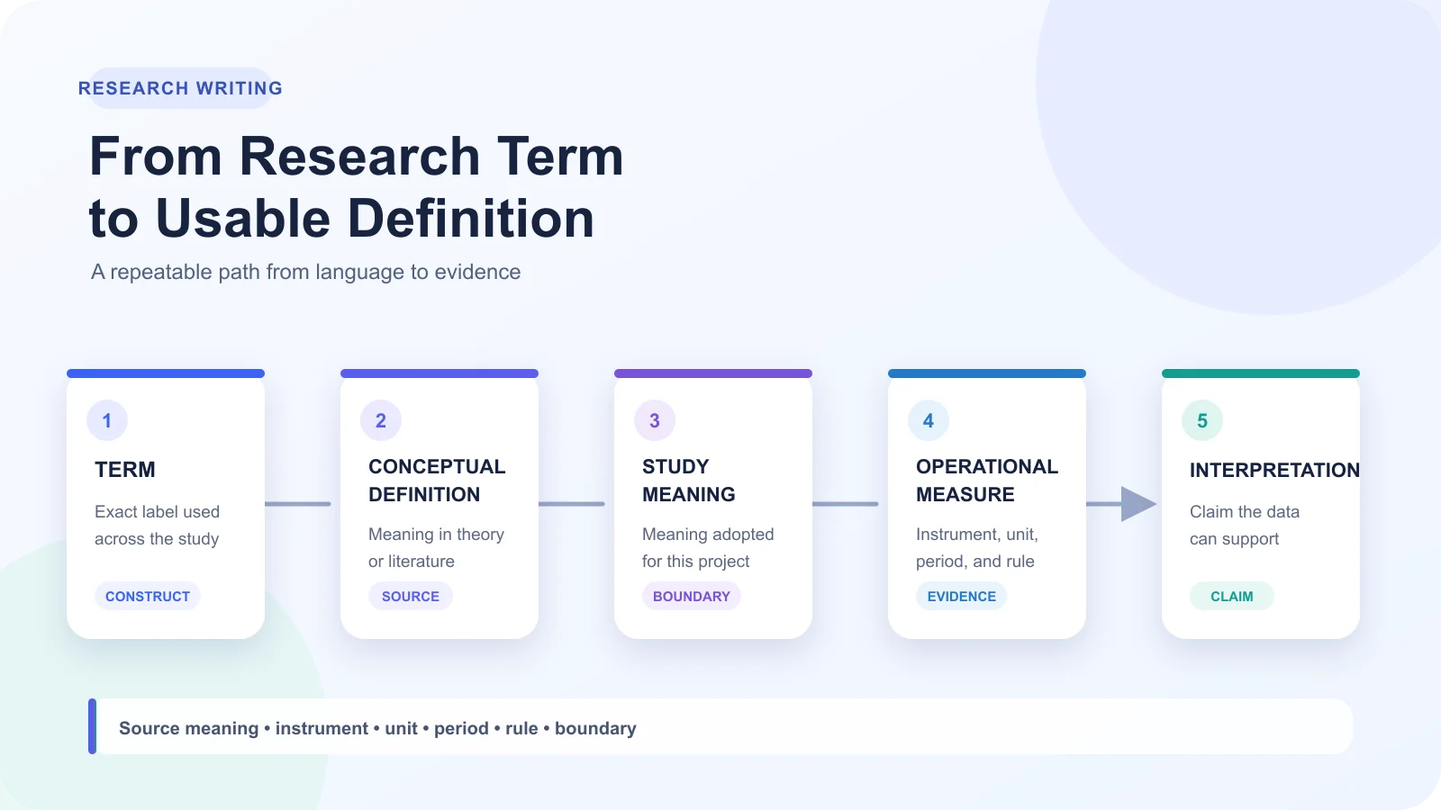
Learning how to make scientific diagrams for research papers starts before software. Define the relationship, mechanism, comparison, or sequence the reader must understand, then identify the evidence for each label, connector, value, and visual claim.
Write the one-sentence figure job
Use a concrete sentence: "Show how X changes Y under Z condition for readers comparing A and B." Replace each placeholder with the paper's entities. If the sentence combines unrelated findings, split the work into panels or remove the secondary message. A figure job guides inclusion, not decoration.
Separate supported content from visual ideas
Create two lists. Supported content comes from validated data, approved source material, or the manuscript's documented interpretation. Visual ideas cover reading order, grouping, spacing, color, and emphasis. Do not let an arrow introduce causality the evidence does not establish. Mark uncertain content for author review instead of smoothing it into the composition.
Collect sources, data, permissions, and journal instructions
Build a brief that another collaborator can audit:
- Record the source for every label, value, equation, scale bar, and relationship.
- Save validated plots or data separately from illustrative assets.
- Note the license and permitted use for each icon, photograph, map, or adapted figure.
- Keep the target journal's current figure instructions beside the editable master.
A 2021 PLOS Biology guide connects clear image-based figures with deliberate planning, annotation, audience awareness, layout, and transparent image preparation. (Jambor et al., 2021) Treat the brief as a scientific control document that names the message, evidence, permitted assets, intended reader, and submission constraints before design begins.
That evidence boundary is the practical foundation for how to make scientific diagrams for research papers without turning an attractive layout into an unsupported claim.
Step 2: Choose the Right Scientific Diagram Type
Knowing how to make scientific diagrams for research papers begins with the relationship the figure must explain. Choose the form before styling. A pathway cannot rescue evidence that is really a comparison.
| Research purpose | Diagram type | Disciplines | Build with |
|---|---|---|---|
| Causation or feedback | Mechanism, pathway, cycle | Biology, chemistry, medicine | Connectors; specialist tools |
| Stages or branches | Workflow or study design | Medicine, biology, interdisciplinary work | Flowchart or vector editor |
| Parts and interfaces | Apparatus or system schematic | Physics, engineering, chemistry | Vector or domain tool |
| Measured patterns | Data plot | Any quantitative field | Statistical software with source data |
Mechanisms, pathways, and cycles
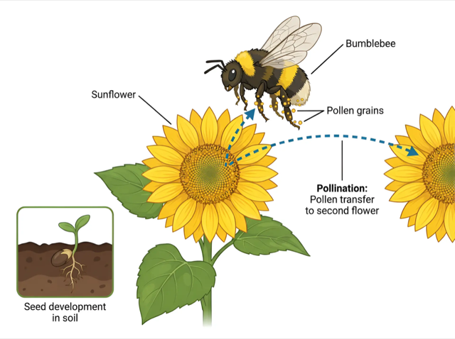
Use these forms for direction, interaction, or recurrence. Keep arrow meaning consistent. Create chemical structures in specialist software, not with generic shapes.
Experimental workflows and study designs
Use a workflow when sequence is the argument. Show inputs, decisions, cohorts, and outputs. Medicine may need participant flow; interdisciplinary work may show handoffs between methods.
Apparatus, architecture, and system schematics
Choose a schematic when arrangement or interfaces matter. Physics setups may need beam paths; engineering diagrams need boundaries and connections.
When the figure should be a data plot instead
Use a plot when magnitude, distribution, trend, or uncertainty is the evidence. Keep values tied to source data. Learning how to make scientific diagrams for research papers includes separating illustration from quantitative analysis.
A 2021 review in Psychological Science in the Public Interest examines visual data communication through encoding, comprehension, and uncertainty. (Franconeri et al., 2021) Its scope supports matching the figure form to the relationship while preserving uncertainty, rather than forcing results into a process diagram.
Glossary
- Pathway: directional biological, chemical, or medical interactions.
- Workflow: ordered procedures, decisions, inputs, and outputs.
- Schematic: components and their connections, simplified.
- Data plot: measured or calculated values displayed visually.
Step 3: Build an Editable Scientific Diagram Master
Block the reading order before styling
A 2021 PLOS Biology guide recommends planning an image-based figure's layout and annotations for its audience while keeping image preparation traceable. Build the first pass as labeled boxes and connectors, then check whether a reader can follow the claim before choosing color or detail. (Jambor et al., 2021)
- Put the main claim or endpoint where the reading path naturally finishes.
- Assign one scientific idea to each node or panel.
- Draw only relationships supported by the source material.
- Keep a short source note beside each label during drafting.
Keep labels, nodes, and connectors revisable
An AI-generated image can suggest composition, but a flattened picture is not a structured master. Revising one arrow or term may require regenerating the whole image. FigEditor Flowchart mode instead supports editable SVG nodes and connectors, so authors can change the structure without rebuilding unrelated elements. (FigEditor, n.d.)
Name layers or groups by meaning, not appearance. "Control group" survives a style change; "blue box" does not. Keep text as text, connectors attached to their nodes, and imported plots or validated structures separate from illustration elements.
Use a source-grounded prompt template
Copy this template and replace the bracketed fields with verified material:
Create an editable scientific diagram draft.
Figure job: [one claim, process, or relationship]
Audience: [specialist field and expected knowledge]
Approved sources: [source titles, identifiers, or supplied notes]
Diagram type: [mechanism, pathway, workflow, apparatus, or architecture]
Required elements: [verified labels, entities, stages, values, and units]
Required relationships: [direction and meaning of each connector]
Reading order: [start point, sequence, endpoint]
Visual constraints: [panel count, non-color cues, label hierarchy]
Do not add: [unsupported entities, values, causal links, or citations]
Output: separate editable nodes, labels, connectors, and source assets
Flag uncertainty: mark any unresolved item for human review
Know what AI should not generate
Warning: Do not ask a general AI tool to invent source data, statistical plots, chemical structures, scale bars, citations, or scientific relationships. Supply validated outputs from the appropriate specialist workflow, then use the diagram master to arrange and explain them.
Before styling, compare the draft with every approved source. Resolve uncertain labels and connections now. Visual polish applied to an unsupported mechanism only makes the error harder to notice.
Step 4: Verify Scientific Accuracy and Image Integrity
Learning how to make scientific diagrams for research papers means treating the figure as scientific claims. Send each claim back to its source, data file, or specialist tool before submission.
Check labels, arrows, structures, values, units, and scale bars
Read the diagram in order. Match labels to targets, arrows to supported directions, and values to sources. Check signs, units, legends, panel references, and scale bars separately. Visual polish does not establish accuracy.
| Element | General editor can draft | Validation belongs in |
|---|---|---|
| Mechanism | Layout, labels, connectors | Approved sources and subject review |
| Chemical structure | Placement and annotation | Chemical structure software and source record |
| Statistical plot | Panel layout and caption | Analysis output, data, and plotting software |
| Scale bar | Position and legibility | Calibrated image data and acquisition record |
Validate chemical structures and statistical plots in specialist tools
Use an editor to arrange verified output, not reconstruct technical syntax by eye. Check bonds, charges, stereochemistry, plotted values, uncertainty, axis transformations, and calibration in specialist software. Import the checked result without redrawing it.
Distinguish clarification from misleading image manipulation
Clarification may improve cropping, alignment, label placement, or contrast without changing the observation. Reject edits that add, remove, move, or selectively emphasize evidence in ways that change interpretation. Keep the source file and processing record.
Warning: Generative cleanup cannot replace image-integrity review. If an edit changes content or obscures provenance, return to the source data.
Record AI use and human review when required
Nature Portfolio's image-integrity policy calls for faithful representation, documented processing, and retention of source data that may be requested. (Nature Portfolio, n.d.) A 2026 Nature Methods editorial describes Nature Portfolio's AI rules and says those policies will continue to be reviewed and modified, so authors should check the target journal's current policy. ("Using AI Responsibly," 2026)
- Record which elements were generated, edited, plotted, or imported.
- Name the source data and validation tool.
- Identify the scientific and statistical reviewer.
- Check the target publisher's current AI and artwork policy.
- Preserve the editable master, source data, and submission export.
That audit trail is part of how to make scientific diagrams for research papers that remain verifiable through revision.
Step 5: Design for Final-Size Clarity and Accessibility
A diagram is not finished when it looks clear on an editing canvas. Learning how to make scientific diagrams for research papers means judging hierarchy, labels, symbols, and relationships at the size readers will see.
Create hierarchy without decorative clutter
Give the main claim the strongest visual emphasis. Use spacing, alignment, grouping, and restrained line weight to separate primary evidence from supporting context. Remove borders, icons, shadows, or background shapes that do not explain a relationship.
Make text and symbols readable at publication size
Reduce the figure to its intended manuscript width, then inspect labels, subscripts, superscripts, legends, arrowheads, and line styles. Do not assume one font size fits every journal. Compare the scaled figure with the target journal's instructions, and revise the editable master before export.
Use redundant visual cues instead of color alone
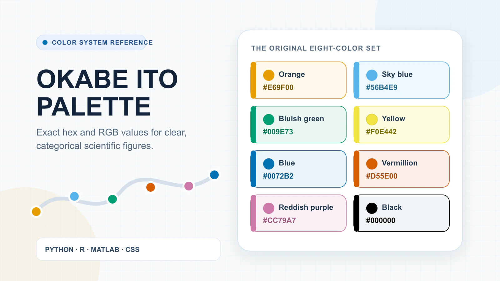
Assign meaning through at least two channels. Combine color with labels, shapes, patterns, line styles, symbols, or position. Apply encoding consistently across panels, legends, and captions.
W3C's WCAG 2.2 states that color cannot be the sole visual means of conveying information, while a 2020 Nature Communications article cautions against color choices that distort or obstruct scientific communication. Pair hue with labels, shapes, patterns, or line styles, then supply a text equivalent for complex online figures. (World Wide Web Consortium, n.d.; Crameri et al., 2020)
Test grayscale, contrast, and panel order
View the figure in color and grayscale at final size. Follow each panel in reading order, checking that references such as A, B, and C match the caption. Contrast should preserve distinctions, but the required threshold may depend on the journal and medium.
- Shrink the figure to its intended publication dimensions.
- Read every label, symbol, unit, and legend without zooming.
- Confirm that color-coded groups remain distinguishable through non-color cues.
- Trace panel order and caption references; keep a text equivalent for complex web or supplemental figures when planning how to make scientific diagrams for research papers.
Step 6: Export for the Target Journal
A 2021 PLOS Biology guide treats image preparation as a traceable part of scientific figure work. Publisher instructions then set the delivery rules for a specific journal. Export only after checking those current instructions, because accepted formats, dimensions, resolution, color handling, fonts, and caption placement can differ. (Jambor et al., 2021; PLOS Medicine, n.d.)
Choose vector or raster by content and journal policy
Choose by what the figure contains and what the journal accepts, not by a fixed hierarchy.
| Format approach | Best suited to | Revision behavior | Check before export |
|---|---|---|---|
| Vector | Diagrams, line art, labels, and connectors | Shapes and text remain independently editable | Accepted vector type, font handling, line weights |
| Raster | Microscopy, photographs, scans, and pixel-based images | Editing changes pixels rather than objects | Accepted raster type, resolution, compression |
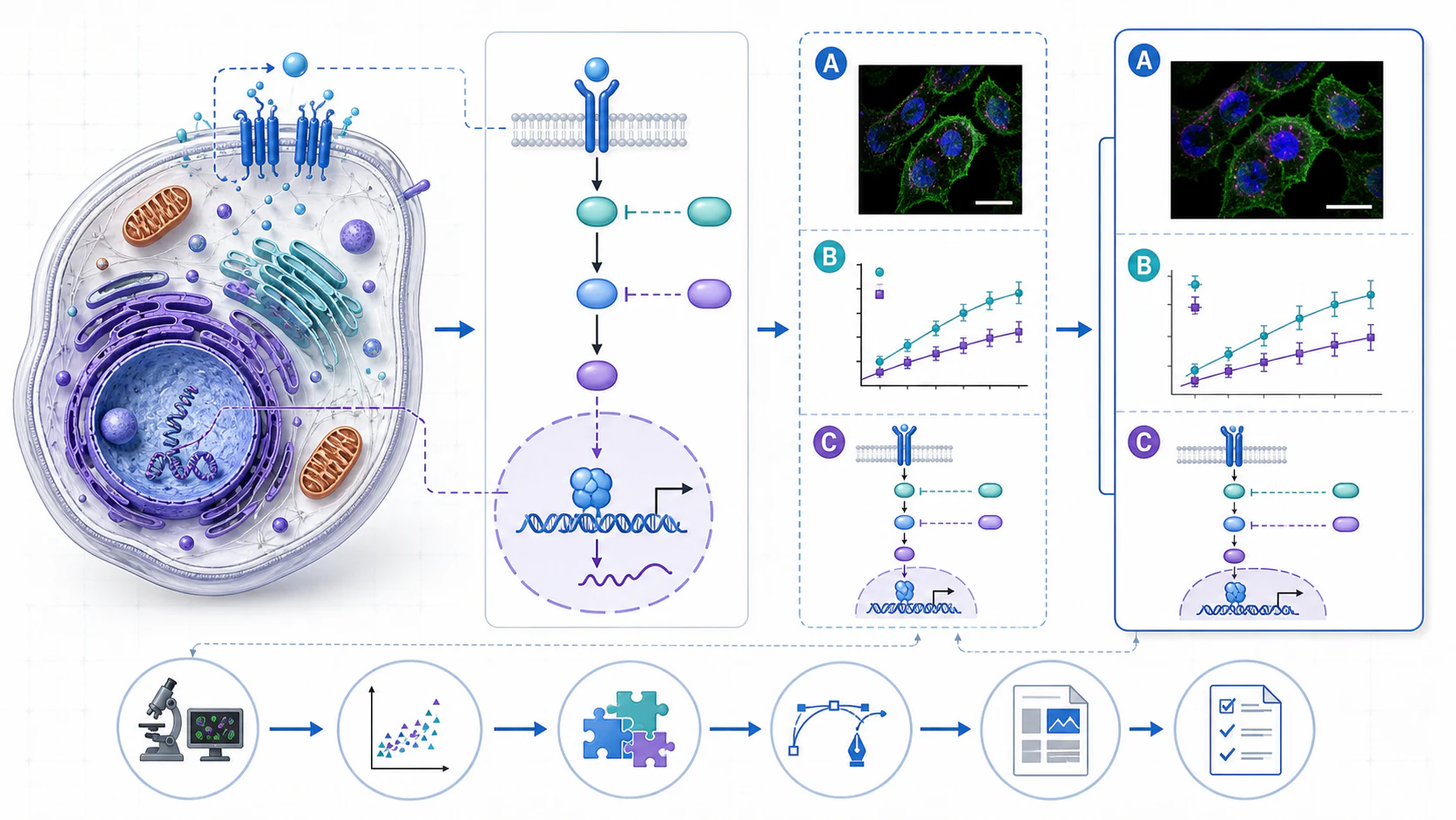
| Mixed figure | Diagrams combined with plots or image panels | Vector layout can hold validated raster assets | How the journal wants mixed content delivered |
Check dimensions, resolution, color mode, and embedded fonts
- Confirm the permitted file type for each figure class.
- Set the required physical dimensions before judging text or line weight.
- Apply the stated resolution and color mode without guessing a universal value.
- Embed, outline, or substitute fonts only as the journal directs.
- Keep captions and panel labels in the locations the submission guide specifies.
Inspect the exported file rather than only the editing canvas
Open the export in a viewer at publication size and high zoom. Check clipped labels, substituted fonts, softened lines, shifted panels, missing symbols, transparency, color, and compression. Compare each panel with the master.
Keep an editable source alongside the submission copy
Archive the editable source, linked assets, font details, and submitted export. If review changes width, labels, panel order, or file type, revise the source instead of tracing a flattened file or altering verified content.
Which Tools Should You Use for Scientific Diagrams?
Choosing software is part of how to make scientific diagrams for research papers, but the content decides. Assign each application verifiable work.
Use specialist software when scientific syntax is the data
Build chemical structures in notation-checking software. Create statistical plots from validated analysis. Import both without redrawing their meaning.
| Tool class | Best role | Do not rely on it for |
|---|---|---|
| Scientific syntax tool | Structures and domain notation | Page composition |
| Statistical plotting software | Plots, axes, uncertainty | Illustration |
| Vector editor | Layout, labels, export | Data or syntax validation |
| AI draft tool | Source-grounded draft | Scientific approval |
| FigEditor | Illustration, editable flowcharts | Chemical or statistical validation |
Use vector editors for precision and finishing
Use vector editing for revisable labels, connectors, spacing, and lines. Import validated outputs, align panels, then test at publication size.
Use AI diagram tools for source-grounded first drafts
Give an AI tool approved text, required entities, and exclusions. Keep its output editable, then check labels, arrows, relationships, and inferences against evidence.
Where FigEditor fits in a hybrid workflow
FigEditor Studio supports scientific illustration projects. Flowchart mode provides editable SVG nodes and connectors. Use either for drafting, while verification remains outside the editor.
A 2021 PLOS Biology guide on image-based figures emphasizes planning, annotation, audience, layout, and transparent preparation. (Jambor et al., 2021) No single application validates every layer of a scientific figure. A hybrid stack answers how to make scientific diagrams for research papers: validate technical content in specialist software, then assemble and revise the communication layer in an editor.
Common Scientific Diagram Problems and How to Fix Them
Late-stage troubleshooting should preserve the verified claim. Authors learning how to make scientific diagrams for research papers should repair the editable master, then repeat the final-size export check.
The diagram is accurate but impossible to scan
- Symptom: the science is correct, but the path is unclear. Cause: flat hierarchy, crowded labels, or decoration. Fix: restate the figure job, group related elements, remove non-explanatory styling, and test at final size.
Labels or arrows drift during revision
- Symptom: labels detach, connectors miss nodes, or panel references mismatch. Cause: revisions happened in separate copies or objects moved independently. Fix: return to one master, reattach connectors, and verify labels against the source.
The export looks different from the canvas
- Symptom: text shifts, lines disappear, objects clip, or raster elements soften. Cause: export settings, fonts, transparency, or resampling changed the output. Fix: inspect the exported file at target size and correct the master, not the export.
The journal asks for a different format or width
- Symptom: the figure fails current delivery instructions. Cause: a presumed universal format or outdated specification. Fix: apply the journal's current width and format requirements to the master, then repeat readability and integrity checks.
A 2021 PLOS Biology guide frames clear image-based figures around planning, annotation, audience, layout, and transparent image preparation. (Jambor et al., 2021) When a figure is hard to scan or changes during export, return to the editable master instead of patching the submission copy, then repeat final-size and journal-specific checks.
Frequently Asked Questions
What software do researchers use to make scientific diagrams?
Researchers combine specialist scientific software, statistical plotting tools, and vector or diagram editors. When learning how to make scientific diagrams for research papers, match each tool to the content it can validate, then assemble verified outputs in an editable master.
Can I use AI to create a diagram for a research paper?
Yes, as a source-grounded draft that humans verify. A 2026 Nature Methods editorial describes Nature Portfolio's disclosure and generated-artwork rules and says its AI policies will continue to be reviewed. ("Using AI Responsibly," 2026) Check the target journal, disclose use when required, and validate science, statistics, licensing, accessibility, labels, values, and scale bars before submission.
Should a scientific diagram be vector or raster?
Choose by content and journal policy. Vector formats suit revisable lines, labels, and connectors. Raster formats suit image-based panels. A mixed figure may use both before final export.
What resolution should a scientific figure use?
Use the target journal's current requirement. Resolution can depend on image type, dimensions, and submission format, so no single value applies to every research paper. (PLOS Medicine, n.d.)
How do I make a scientific diagram colorblind-friendly?
Do not encode meaning with color alone. Pair color with labels, shapes, patterns, line styles, or symbols, then test the figure in grayscale and at publication size. (World Wide Web Consortium, n.d.)
How do I check whether a scientific diagram is accurate?
Compare labels, arrows, structures, values, units, plots, and scale bars with approved sources. Validate chemical structures and statistics in specialist tools. Record human review and inspect the export. That verification pass completes how to make scientific diagrams for research papers.
Glossary
- Editable master: The revisable source file used through review and export.
- Specialist tool: Software that validates domain syntax, data, or calculations.
- Final-size test: Inspection at the dimensions readers will receive.
Conclusion: Build for Revision, Verification, and Submission
A 2021 PLOS Biology guide treats clear image-based figures as products of planning, annotation, audience awareness, layout, and transparent image preparation. (Jambor et al., 2021) A publication-ready diagram therefore needs an editable, source-grounded master that can survive scientific review, accessibility checks, final-size inspection, and journal-specific export without changing its supported claim.
That standard defines how to make scientific diagrams for research papers: choose the form, build the structure, verify the content, test the presentation, and export against current instructions. FigEditor Studio can hold an editable diagram draft, but authors remain responsible for scientific, statistical, accessibility, licensing, and journal-compliance review.
- Preserve the approved evidence and editable master.
- Verify labels, connectors, values, units, and scientific syntax.
- Test hierarchy, non-color cues, and readability at final size.
- Export only after checking the target journal's current requirements.
References
- Jambor, H., Antonietti, A., Alicea, B., Audisio, T. L., Auer, S., Bhardwaj, V., Burgess, S. J., Ferling, I., Gazda, M. A., Hoeppner, L. H., Ilangovan, V., Lo, H., Olson, M., Mohamed, S. Y., Sarabipour, S., Varma, A., Walavalkar, K., Wissink, E. M., & Weissgerber, T. L. (2021). Creating clear and informative image-based figures for scientific publications. PLOS Biology, 19(3), e3001161. https://doi.org/10.1371/journal.pbio.3001161
- Franconeri, S. L., Padilla, L. M., Shah, P., Zacks, J. M., & Hullman, J. (2021). The science of visual data communication: What works. Psychological Science in the Public Interest, 22(3), 110-161. https://doi.org/10.1177/15291006211051956
- Crameri, F., Shephard, G. E., & Heron, P. J. (2020). The misuse of colour in science communication. Nature Communications, 11(1), 5444. https://doi.org/10.1038/s41467-020-19160-7
- Using AI responsibly in scientific publishing. (2026). Nature Methods, 23(2), 271. https://doi.org/10.1038/s41592-026-03020-1
- Nature Portfolio. (n.d.). Image integrity and standards. https://www.nature.com/nature-portfolio/editorial-policies/image-integrity
- World Wide Web Consortium. (n.d.). Understanding Success Criterion 1.4.1: Use of color. https://www.w3.org/WAI/WCAG22/Understanding/use-of-color
- PLOS Medicine. (n.d.). Figures. https://journals.plos.org/plosmedicine/s/figures
- FigEditor. (n.d.). Studio. https://figeditor.ai/studio?mode=flowchart
Last reviewed and updated: August 2026. Author: our editorial team. For tailored guidance, contact our team.