

Research Methodology Diagram: A 6-Step Guide for Papers
Learn how to turn a Methods section into a clear research methodology diagram, choose the right structure, and prepare an editable figure for review.
On this page
- What is a research methodology diagram?
- When a methodology diagram helps, and when it does not
- Choose the right diagram structure for your study
- Linear pipeline
- Branching experimental workflow
- Parallel study arms
- What to include in a methods figure for publication
- Turn your Methods section into a diagram in 6 steps
- 1. Write the one-sentence job of the figure
- 2. Extract inputs, actions, decisions, and outputs
- 3. Group details into reader-level stages
- 4. Choose a route and draft short labels
- 5. Compare the diagram with the manuscript
- 6. Test the final-size export
- Worked example: from a Methods paragraph to a diagram brief
- Why editability matters after the first draft
- What our product data suggests
- Final check before submission
- Scientific agreement
- Visual delivery
- Research methodology diagram FAQ
- What is a methodology chart?
- What is the difference between a methodology diagram and a conceptual framework?
- Does every research paper need a methodology diagram?
- Is a PRISMA flow diagram a research methodology diagram?
- Can AI create a methodology diagram from my Methods section?
- Create an editable research methodology diagram
- References
A research methodology diagram turns a study's methods into a visual route through the work. It shows how samples, participants, datasets, or other inputs move through procedures, decisions, analysis, and outputs. The figure should help a reader understand the study's structure. It does not replace the Methods section.
The best starting point is not a blank canvas. Start with the verified Methods text, decide what one relationship the reader must see, and build only the nodes and connections needed to show it.
Key takeaways
- Match the diagram structure to the study, not to a generic research-process template.
- Use a linear pipeline for one route, branches for decisions, and parallel lanes for study arms.
- Keep eligibility rules, controls, transformations, and analysis visible when they affect interpretation.
- Draft short labels first, then check every node and arrow against the manuscript.
- Keep text and connectors editable so coauthor and reviewer changes do not require a rebuild.
What is a research methodology diagram?
A research methodology diagram is a figure that maps the operational structure of a specific study. It usually connects research inputs to key procedures, decision points, controls, analysis, and the resulting evidence. Unlike a generic research-process chart, it should reflect what the authors actually did and use the same terminology as the paper.
The article focuses on designing the methods figure itself. For the order and evidence chain of a complete IMRaD manuscript, use the separate workflow linked near the submission checklist.
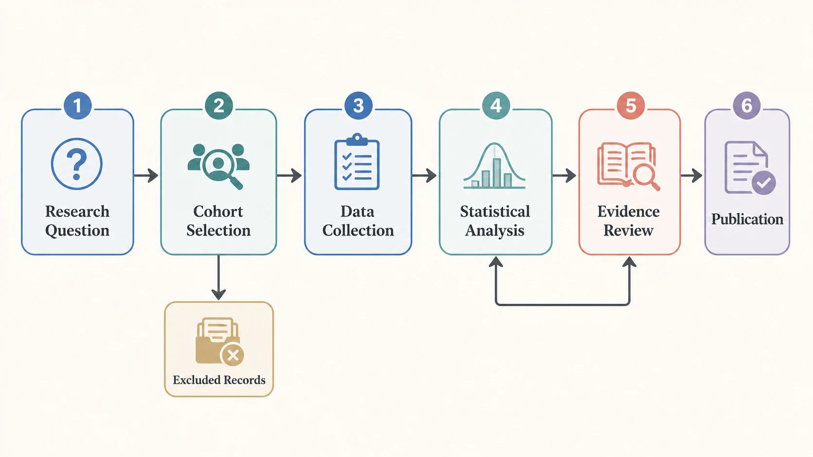
The useful word here is specific. A row of boxes labeled "question, literature review, data collection, analysis, conclusion" may describe research in general, but it tells a reviewer little about your study. A paper-level methodology figure should answer concrete questions: What entered the workflow? What happened to it? Where did routes split? Which comparison or control mattered? What analysis produced the reported output?
| Visual | Main question it answers | What it should contain |
|---|---|---|
| Research methodology diagram | How was the study carried out? | Study-specific inputs, procedures, decisions, analysis, outputs |
| Conceptual framework | Which concepts or variables are related? | Constructs, hypotheses, expected relationships |
| Graphical abstract | What is the paper's central story? | Question, selected method or mechanism, main supported outcome |
| PRISMA flow diagram | How were records identified and selected for a systematic review? | Identification, screening, inclusion, exclusions |
| General research-process chart | What are the broad stages of doing research? | Question, review, design, collection, analysis, reporting |
The distinction prevents a common mismatch: drawing the paper's theory when the reader needs the experimental route, or drawing a generic thesis timeline when the journal figure needs a study-specific methods map.
When a methodology diagram helps, and when it does not
A methods figure is most useful when the study contains enough structure that prose alone makes the route hard to hold in working memory. Common cases include multiple cohorts, preprocessing stages, experimental arms, repeated measurements, model-training stages, inclusion decisions, or a chain of data transformations.
It can also expose a manuscript problem. If a diagram needs a branch that the Methods text never explains, the prose may be incomplete. If two nodes use different names for the same dataset, the paper may have a terminology mismatch. Before drawing, define the study's key terms and operational rules so the figure and Methods use the same labels. The diagram becomes a consistency check as well as a communication device.
Do not add one merely to decorate the paper. A methodology diagram may be unnecessary when the method has only one or two obvious actions, the target journal limits display items, or a standard reporting flow already covers the required information. For a systematic review, for example, use the appropriate PRISMA 2020 flow diagram for record identification and selection rather than replacing it with a custom experimental workflow.
The figure cannot repair weak reporting. Authors still need to describe how and why the study was conducted in the manuscript. In health research, the EQUATOR Network lets authors search reporting guidelines by study type, clinical area, and report section. The target journal and relevant guideline determine what must be reported; the diagram helps readers orient themselves within that account.
Choose the right diagram structure for your study
Select the structure after you identify the route through the study. Three patterns cover many paper figures without forcing unrelated methods into the same visual grammar. A research methodology flowchart should follow the same rule: its geometry must describe the actual study route.
| Structure | Use it when | Typical route | Watch for |
|---|---|---|---|
| Linear pipeline | Every item follows the same ordered sequence | Input → preparation → measurement → analysis → output | Hiding a real exclusion or feedback step |
| Branching workflow | Eligibility, quality control, or a condition changes the route | Input → decision → route A / route B → comparison | Unlabeled decision criteria or dead-end branches |
| Parallel arms | Groups, modalities, datasets, or models run side by side | Shared input → parallel procedures → shared analysis | Lanes with inconsistent detail or false visual equivalence |
Linear pipeline
Use a linear pipeline when sequence carries the meaning. A materials study might move from specimen preparation to treatment, measurement, feature extraction, and statistical analysis. A machine-learning study might show data preparation, training, validation, testing, and evaluation.
Keep the reading direction stable. If a feedback step exists, draw one return connector and label what triggers it. Do not turn a mostly linear method into a loop simply because circular diagrams look more polished.
Branching experimental workflow
Use a branch when a rule or intervention sends items down different paths. The decision node should state the criterion in a few words, such as "eligible?", "quality check passed?", or "assigned intervention". Label outgoing connectors if the meaning is not obvious.
Branches are also useful for showing exclusions, but the figure and Methods text must agree on the reason and stage. A box called "removed data" without a criterion invites more questions than it answers.
Parallel study arms
Use parallel lanes when the comparison is the point. Start from a shared source only if the groups truly share it, then align equivalent stages horizontally. If one arm receives an extra procedure, show it rather than preserving visual symmetry.
Parallel layouts also work for multimodal studies. Image, text, and sensor data can occupy separate lanes before fusion and evaluation. The lanes should make dependencies clearer, not imply that every modality has the same sampling, preprocessing, or analytical weight.
What to include in a methods figure for publication
Here, "for publication" means ready for scientific and visual review. It does not establish compliance with a particular journal. Every visible element should help the reader reconstruct the study logic. The exact content varies by discipline, but a useful drafting checklist is:
- Input or population: participants, samples, datasets, source documents, simulations, or specimens.
- Selection rules: inclusion, exclusion, allocation, filtering, or quality-control decisions that change the route.
- Core procedures: interventions, measurements, preprocessing, transformations, model stages, or experimental operations.
- Comparison and control: experimental arms, baselines, controls, reference standards, or paired conditions.
- Analysis: the analytical stage at the right level of detail, including a named model or statistical family when it matters to interpretation.
- Output: the evidence or artifact produced by the workflow, not an unsupported conclusion.
The diagram should omit implementation detail that does not change a reader's understanding. File names, routine software clicks, every reagent volume, or every hyperparameter usually belong in Methods, a table, code, or supplementary material. Keep a detail when removing it would hide a decision, comparison, source of bias, or route to the reported result.
Use verbs for procedures and nouns for inputs or outputs. "Normalize signal" is clearer than "Normalization," while "Normalized feature matrix" works as an output label. The verb-and-noun distinction makes arrows easier to interpret.
Turn your Methods section into a diagram in 6 steps
1. Write the one-sentence job of the figure
Complete the figure brief with one line: "After viewing the figure, the reader should understand ____." A useful answer names a relationship, such as how participants move from recruitment to analysis or how raw images become the evaluated model output.
Rougier, Droettboom, and Bourne make the same point in Ten Simple Rules for Better Figures: identify the message before developing the figure. For a methods diagram, that message is usually a route, comparison, or dependency rather than a result claim.
If the answer tries to cover the background, theory, method, results, and implications, split the work. One figure needs one primary job.
2. Extract inputs, actions, decisions, and outputs
Mark nouns that represent study objects and verbs that represent operations. Then mark every conditional phrase: "if," "after exclusion," "randomly assigned," "for each group," or "until convergence." These phrases often become branches, lanes, or loops.
Extract the structure from the approved protocol, analysis plan, laboratory record, code path, or current Methods draft. Memory is a poor source for details that affect reproducibility.
3. Group details into reader-level stages
Combine actions that perform one communicative job. Five preprocessing commands may become "quality control and normalization" if their internal order does not affect the figure's message. Keep them separate when one transformation creates the input to a later comparison.
A practical first draft often contains 4 to 8 main nodes. That is a starting heuristic, not a publication rule. Complex studies may need more, while a compact methods panel may need fewer.
4. Choose a route and draft short labels
Pick a linear, branching, or parallel structure. Write the labels before adjusting color, icons, or spacing. Short labels force you to decide what each node does.
Connectors need semantics too. Direction should match the order of the method. A dashed line, color change, or return arrow should have a defined meaning and use it consistently.
5. Compare the diagram with the manuscript
Read each route from start to finish and point to the supporting passage in Methods. Check participant or sample counts, group names, preprocessing order, abbreviations, decision criteria, model names, and analytical outputs. Remove anything the manuscript cannot support.
Then read in the other direction. For every method that affects a reported result, ask whether the visual hides a necessary relationship. The goal is agreement, not maximum detail.
6. Test the final-size export
Export at the width and format requested by the target journal, then inspect that file at its intended size. Labels that look comfortable on a large editing canvas may fail in a one-column figure.
Nature's current house specifications provide one useful example of how exact journal rules can be: they call for legible 5 to 7 pt figure text, editable text, accessible color choices, and vector artwork for lines, arrows, boxes, and labels. Those are Nature requirements, not universal values. Always check the current instructions for your target publication.
Worked example: from a Methods paragraph to a diagram brief
The methodology diagram example below is fictional. It demonstrates compression and does not describe a real experiment.
A team collects de-identified sensor recordings from two study sites. Recordings that fail a predefined signal-quality check are excluded. Accepted recordings are normalized, divided into development and held-out test sets by site, and used to train a classifier. Performance is evaluated on the held-out site, followed by an error review grouped by acquisition condition.
First extract the structure:
| Methods text element | Diagram role | Draft label |
|---|---|---|
| De-identified recordings from two sites | Input | Site A + Site B recordings |
| Predefined signal-quality check | Decision | Quality check passed? |
| Failed recordings | Exclusion branch | Excluded recordings |
| Normalize accepted recordings | Procedure | Normalize signals |
| Divide by site | Branch or parallel lanes | Development site / held-out site |
| Train classifier | Procedure | Model training |
| Evaluate on held-out site | Analysis | External-site evaluation |
| Group errors by acquisition condition | Review loop or final analysis | Error analysis by condition |
The figure's job could be: "Show how site-separated recordings move from quality control to held-out evaluation." That wording rules out a generic research-process chart and points toward a branching pipeline with a site-based split.
The draft should not add model performance, sample counts, or causal claims because the paragraph does not provide them. If the actual manuscript includes counts or a named model that readers need to interpret the evaluation, add those only after verification.
Copy the compact brief below before opening a diagram tool:
Methodology diagram brief
- Figure job: [the one relationship a reader should understand]
- Verified input: [participants, samples, dataset, or source]
- Required stages: [ordered procedures or transformations]
- Decisions and branches: [criterion + route for each outcome]
- Comparison or control: [groups, baseline, reference, or none]
- Final analytical output: [what the workflow produces]
- Exact labels and abbreviations: [manuscript-approved wording]
- Details that must stay in prose: [parameters or reporting items omitted from the figure]
Why editability matters after the first draft
The first draft rarely survives coauthor review unchanged. Labels are shortened, arrows reverse, groups merge, a control becomes visible, or the target journal requires a different width. A flattened image turns each correction into a redraw risk.
Editable text, nodes, and connectors let you make a local correction while preserving approved parts of the composition. They also make terminology checks easier because labels remain selectable rather than baked into pixels. Vector structure helps with resizing, but it does not guarantee that a journal accepts a particular file type. Use the journal's current export specification.
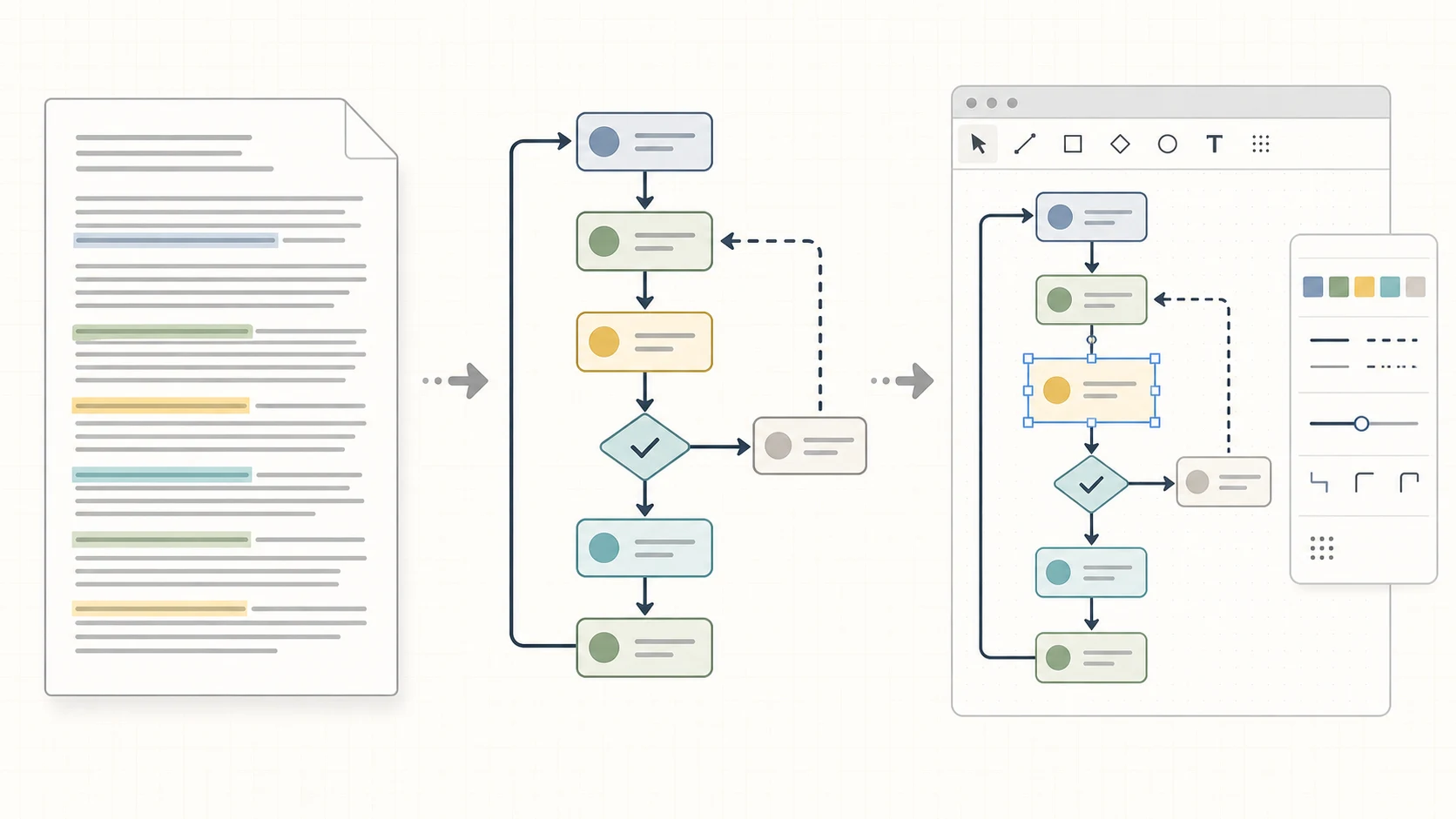
In FigEditor, the Text to Diagram Generator can turn a verified description into a workflow, branching diagram, study design, cycle, model, or architecture image draft that you can review and refine in the illustration workspace. It does not automatically convert the result into a structured Flowchart project.
When you need selectable nodes, connectors, layout controls, SVG source access, undo, and version restoration, start a separate Flowchart project in FigEditor Studio. Treat either route as a starting point and check every scientific detail against the source material.
What our product data suggests
Our read-only product snapshot covered 7,542 registered accounts and 10,560 deduplicated generation tasks through August 11, 2026. A voluntary survey adds a smaller but more direct signal about intent: 29 of 35 free-user respondents selected research-paper figures as a creation task. Among 12 paid-user respondents, 9 named paper figures as their most-used task and 10 said the largest time saving occurred at the first-draft stage.
These samples describe activity inside one product. The survey was voluntary and self-selected, so it cannot represent all researchers. The result explains the guide's emphasis: a diagram generator is most useful when it shortens the path to an editable first draft while leaving scientific review with the author.
Final check before submission
Run two reviews: one for scientific agreement and one for visual delivery.
Scientific agreement
- Every node and connector has support in the Methods, protocol, or analysis plan.
- Group names, counts, time points, abbreviations, and model names agree across the figure, caption, Methods, and Results.
- Branches show real criteria rather than decorative alternatives.
- The output states what the method produces, without implying a stronger result.
- The figure follows the reporting guideline relevant to the study when one applies.
Visual delivery
- The reading order is obvious without narration.
- Text remains legible at the intended publication width.
- Color is redundant with labels, line styles, or position where needed for accessibility.
- Arrows do not cross labels or imply an unsupported direction.
- The exported file retains the editability and format required by the target journal.
- The caption defines abbreviations, symbols, branches, and any detail needed to read the figure independently.
For the paper-level evidence chain around the figure, continue with the figure-first IMRaD workflow. It covers how Methods, Results, Discussion, figures, and claims stay aligned across the full manuscript.
Research methodology diagram FAQ
What is a methodology chart?
A methodology chart is a visual map of how a study or project is carried out. For a research paper, it should show study-specific inputs, procedures, decisions, comparisons, analysis, and outputs rather than only listing generic research stages.
What is the difference between a methodology diagram and a conceptual framework?
A methodology diagram shows what the study does operationally. A conceptual framework shows concepts, variables, or expected relationships that guide the study. One paper may use both, but they answer different reader questions.
Does every research paper need a methodology diagram?
No. Use one when the method contains a sequence, branch, comparison, or data route that becomes clearer visually. The target journal, article type, and display-item limits determine whether it belongs in the main paper, supplementary material, or nowhere.
Is a PRISMA flow diagram a research methodology diagram?
It is a specialized reporting flow for systematic reviews. PRISMA 2020 diagrams document records identified, screened, excluded, and included. Use the official template that matches the review and source type rather than substituting a generic workflow.
Can AI create a methodology diagram from my Methods section?
AI can organize verified text into a visual draft and suggest a layout. Authors remain responsible for scientific accuracy, confidential information, licensing, disclosure, and compliance with journal policy. Check every label, relationship, count, and implication before submission.
Create an editable research methodology diagram
Start with the paragraph you already trust. Remove confidential or identifying information and state the one job of the figure. Use the FigEditor Text to Diagram Generator when you want a workflow, branching diagram, study design, cycle, model, or architecture image draft that you can refine in the illustration workspace.
If the deliverable needs selectable nodes, connectors, and SVG-level structure, start a separate Flowchart project instead. The two routes solve different editing needs; the Text to Diagram result does not automatically become a Flowchart project.
The useful outcome is not a finished-looking image on the first try. It is a structure your coauthors can question and you can correct without rebuilding the entire figure.
References
- International Committee of Medical Journal Editors. (n.d.). Preparing a manuscript for submission to a medical journal. Accessed August 12, 2026.
- EQUATOR Network. (n.d.). Search for reporting guidelines. Accessed August 12, 2026.
- PRISMA Statement. (2020). PRISMA 2020 flow diagram.
- Rougier, N. P., Droettboom, M., & Bourne, P. E. (2014). Ten simple rules for better figures. PLOS Computational Biology, 10(9), e1003833.
- Springer Nature. (n.d.). Preparing figures: Our specifications. Accessed August 12, 2026.